We are currently updating our site; thank you for your patience.
Interface and Environment
Using Nucleus Service - Working Environment
Understanding the Nucleus Service working environment and Controls and Functions is important as it minimises confusion when using the system.
All Nucleus Service beginners should familiarise themselves with the following topics in order to get the most out of the system functionality.
Environment
Active Title Bar
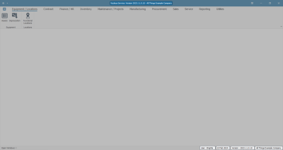
- This bar lists the Software Version and Company Name, or test environment name e.g. All Things Example Company
- The User name, Date, Software Version and Company Name, or Test environment name, will be in the bottom right of each screen.
Ribbon Tabs
- These tabs enable you to navigate through the different modules within Nucleus Service.
Adjust Screen Size
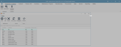
- An active screen can be adjusted in size by clicking on the edge of the screen to reveal the double ended expansion arrow heads, then dragging this arrow to increase or decrease the screen to the size of your choice.
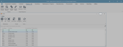
- You can click on the maximise icon in the top right hand of the screen you are working in to enlarge the screen.
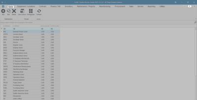
- When you maximise the screen, it removes the secondary ribbon toolbar and pushes it into the Home Tab at the top.
Quick Access Tool Bar
- This can be configured with short-cuts to the screens that you wish to view most often.
- For further information refer to the Quick Access Toolbar topic page.
Ribbon Toolbar
- This displays the content of the selected ribbon tab in more detail.
- In this example, the ribbon toolbar of the Maintenance and Projects ribbon tab is displayed.
Listing Screen
- Click on any ribbon toolbar icons to open a Listing Screen.
- In this example, Inventory has been selected.
- The Parts toolbar icon will be selected within the Inventory ribbon tab.
- The Part Listing screen is displayed.
- The Active Title Bar will now display the title of the selected ribbon toolbar icon as well as the software version and company name.
Listing Screen Overview
Data Grids, Rows and Columns
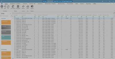
Listing Screens contain one or more data grid(s) of rows and columns.
These contain data relating to the selected ribbon toolbar icon.
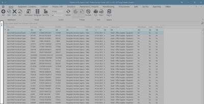
- In this example, the data grid contains rows and columns with information relating to the Assets ribbon toolbar icon.
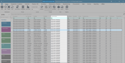
- Rows are selected by either clicking anywhere on the row or in the case of dragging and dropping a row, by specifically clicking in the row selector column.
- Columns are selected by clicking on the column header above the column of choice.
Action Buttons Toolbar
- When you open a Listing screen, the ribbon toolbar is replaced by the Action Buttons toolbar.
- This toolbar includes icons that are used to perform functions within the listing screen, for example :
- Maintenance functions
- Format functions
- Processing functions
- Export functions
- Print functions
- Current Functions
- The Action Buttons toolbar may vary according to the ribbon tab and subsequent ribbon toolbar icon selected.
- This example displays the icons available in the Work Requests action button toolbar.
Toolbar Menu
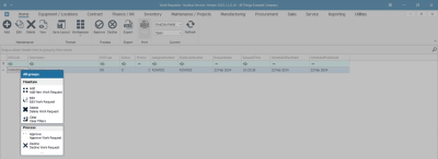
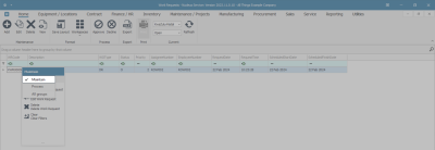
- You can also right click in the data grid to display the Action Buttons toolbar drop-down menu.
- This menu does not contain all the action buttons displayed in the Action Buttons toolbar and will vary according to whichever ribbon tab you are working in.
- In this example, the drop-down menu contains only the Maintain and Process action buttons.
Customise Menu
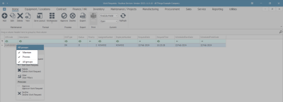
- You can click on the title bar of this drop-down menu to display a list of the action button toolbar groups available to be displayed in this list.
- In this example, you can select to view the Maintain action button, the Process action buttons or All Groups (all the available action buttons) in this menu.
- In this example, Maintain has been selected from the list (Process has been unticked).
- When you have made your selections, click away from the menu to save the changes.
- The drop-down menu will now display the selection, in this case, only the Maintain action buttons.
Functions Tiles
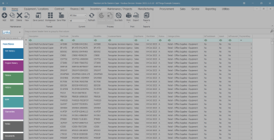
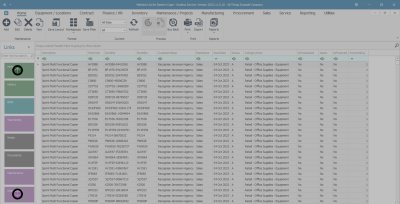
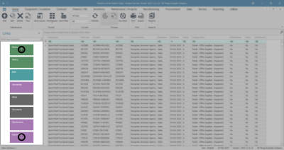
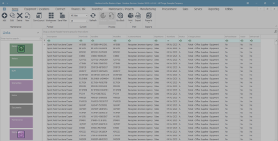
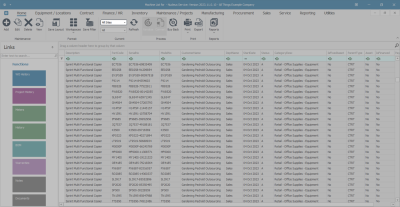
- Most Listing screens contain a Links panel that contains Functions and Processing tiles.
- Each tile will allow you to view data concerning a particular row that you have selected.
- Click anywhere in the panel and
- Either, use the scroll button on your mouse
- Or, use the arrows that appear as you hover over the panel to scroll up and down to find your tile of choice.
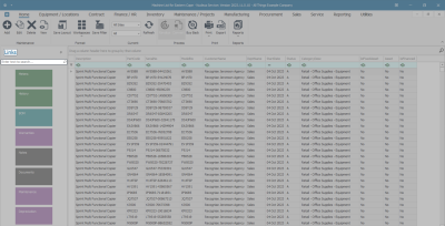
- You can also find your tile of choice by using the Search text box at the top of the Links panel.
- In this search text box, type in the name of the Function tile that you are looking for.
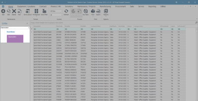
- As you start typing the system will start searching.
- The Links panel will display your choice of tile.
- In this image, we searched for the Depreciation tile.
Docking Panels
- Panels can be docked (pinned) on the screen or undocked (un-pinned or hidden) according to your preference.
- If a panel is docked on the screen the pin icon will be upright.
- If a panel is undocked on the screen the pin icon will be on its side.
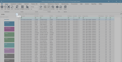
- In this image, the panel is already docked (the pin is upright), click on the docking icon to hide the panel.
- The Links panel is now undocked, and a Links tab is now displayed on the left of the listing screen to show you that there is a hidden panel there.
- You can click on this Links tab to expand and dock the Links panel again at any time.
The Site Filter
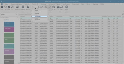
- The Site Filter lets you select the site or company branch within which you wish to work.
- This is only available in relevant listing screens.
- Click on the drop-down arrow and select from the list, the site you wish to work in.
The Status Filter
- The Status or Type Filter allows you to filter the information in the screen according to status / type.
- This is only available in some screens and its content depends on the screen that you are currently in.
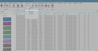
- In this image we are searching for a particular status in the Assets List or Machine List for [ ] screen.
- Click on the drop-down arrow in the status field.
- The drop-down status Type and Description list will be relevant to the screen that is open.
MNU.000.003
