We are currently updating our site; thank you for your patience.
Interface and Environment
Using Nucleus Service - Controls and Functions
Understanding the Controls & Functions and Working Environment of Nucleus Service is important as it minimises confusion when using the system.
All Nucleus Service beginners should familiarise themselves with these two manuals to get the most out of the system functionality.
Additionally, it will be beneficial to review Datagrids and Datagrid Filtering.
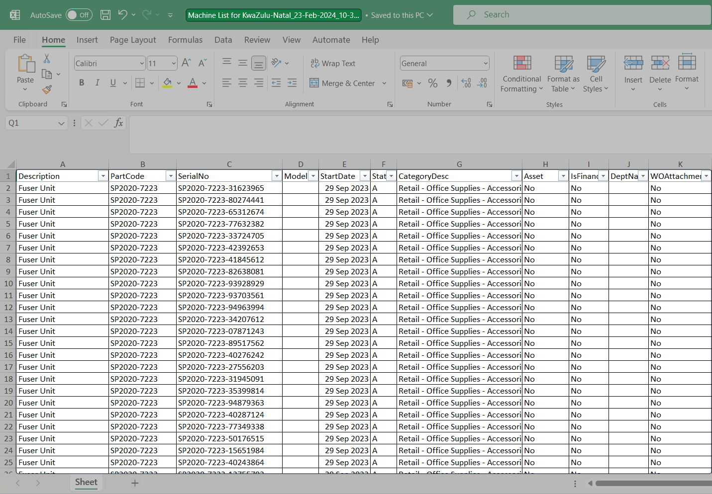
Multiple Data Grids in a Screen
- Some screens have more than one data grid.
- For the system to know which data you wish to work with, click anywhere in that specific data grid.
- In this example there are 2 data grids in the screen.

- In this example there are data grids in the screen.
Drag and Drop Functionality
- The drag and drop screen feature enhances user experience by enabling you to move data back and forth between two grids in the same screen.
- You can select a single item line or multi select item lines and move them from one grid to the other.
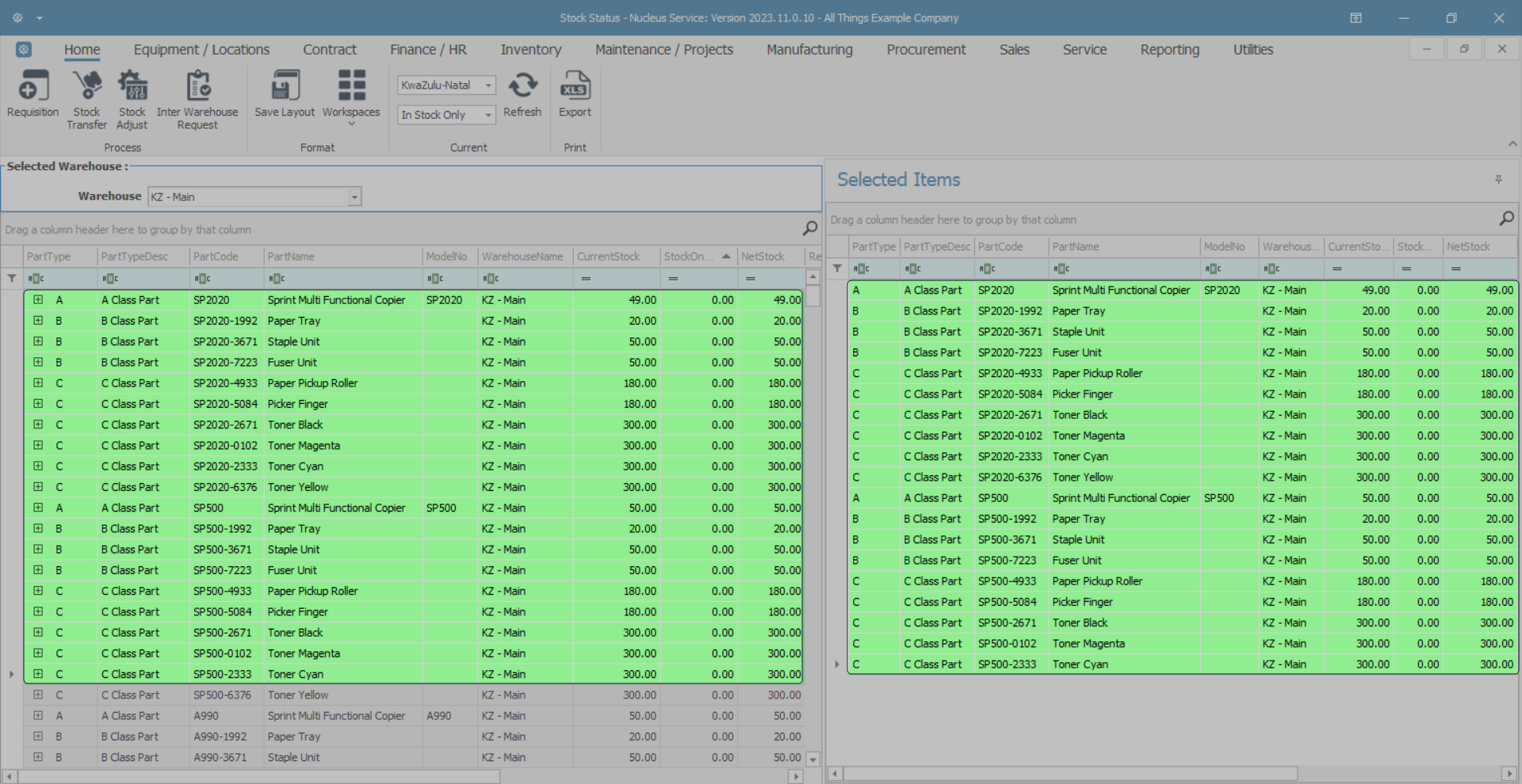
- In the image below -
- the Stock Status screen is divided into,
- the Selected Warehouse data grid, and
- the Selected Items data grid.
Drag and Drop a Single Item Line
- Click and hold in the row selector column of the single item line you wish to move.
- Drag this item line across to the second grid, (in this example, the 'Selected Items' grid), and drop it anywhere in this grid.
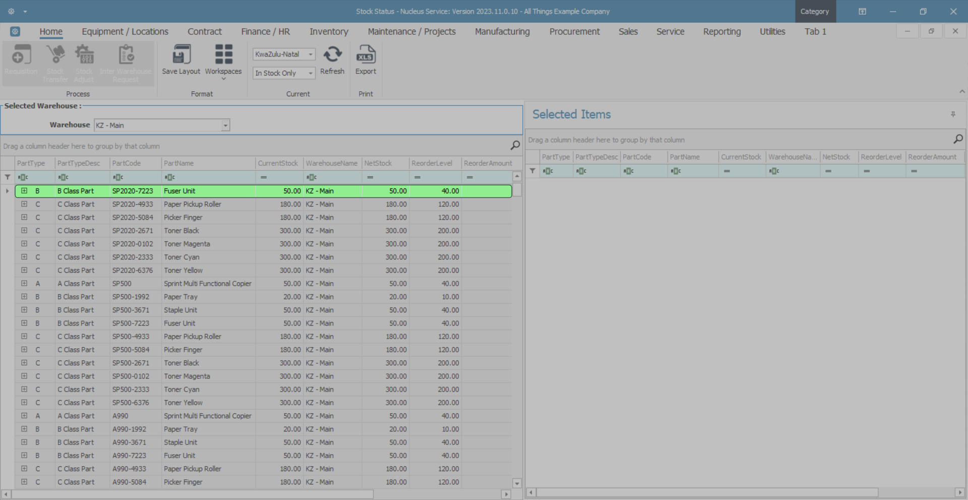
- The single item line can now be seen in the Selected Items frame.
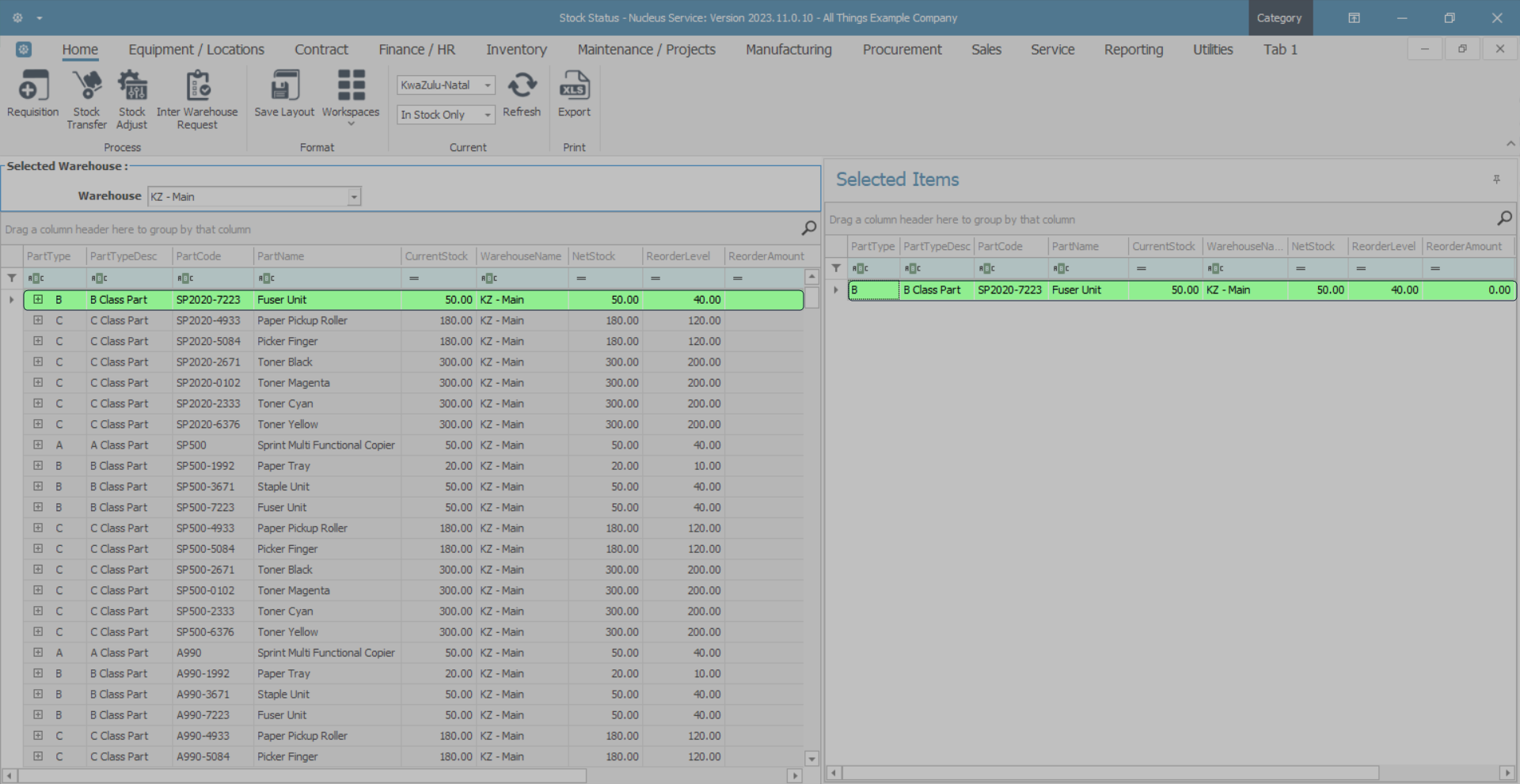
Drag and Drop Multiple Item Lines
You may wish to select more than one item line, either -
- A block of items lines,
- Or
- Several items lines that are in nonsequential order.
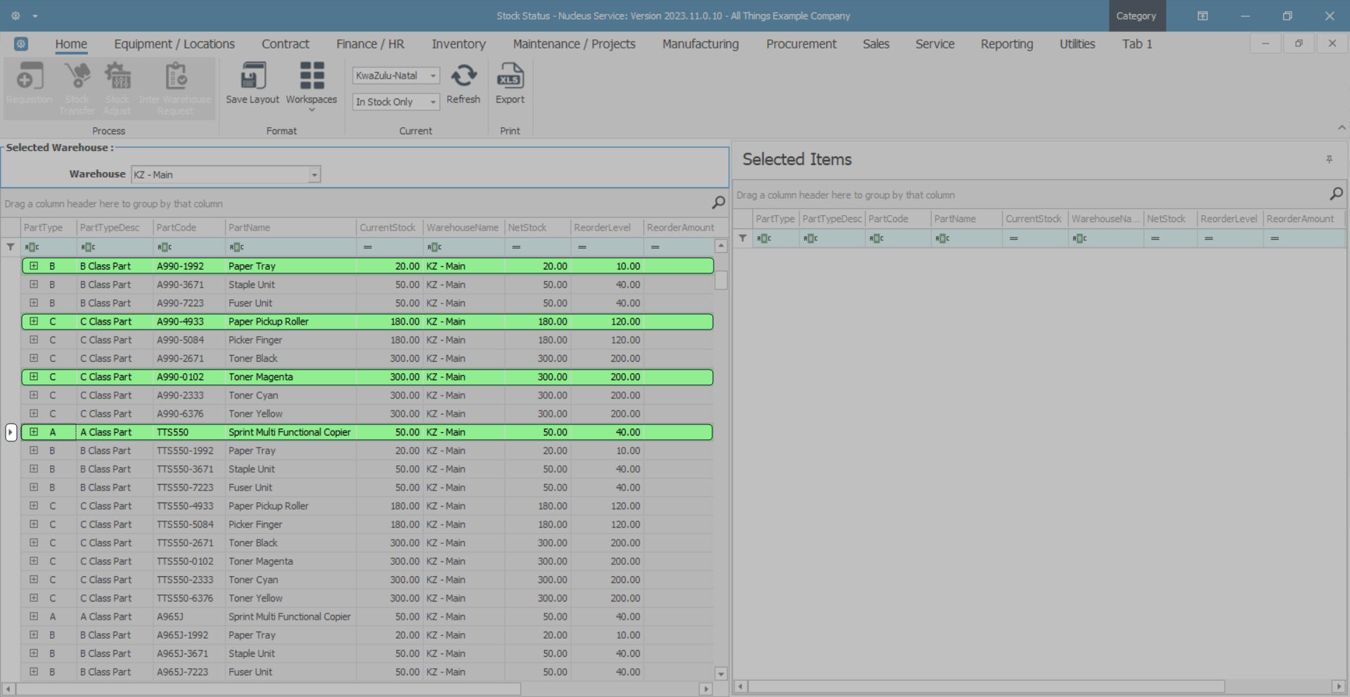
Select Multiple Item Lines - Block
There are two methods to select a block of item lines:
Method 1
- Select the first row in the block that you wish to move.
- Press and hold the Shift button on your keyboard.
- Use your mouse to click on the final row in the block you wish to move thereby highlighting all the rows between and including the first selected and the last selected.
- Still pressing the hold button, click in the row selector column of the final row and drag and drop the whole block to the second grid.
Method 2
- Select the first row in the block that you wish to move.
- Press and hold the Shift button on your keyboard.
- Use the Up and Down arrows on your keyboard to select all the rows that you wish to move. Each line will be highlighted as selected.
- Still pressing the Hold button, click in the row selector column of the final row and drag and drop the whole block to the second grid.
- The block selection of item lines is now reflected in the Selected Items frame.
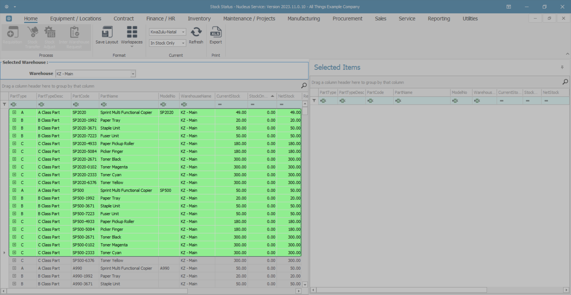
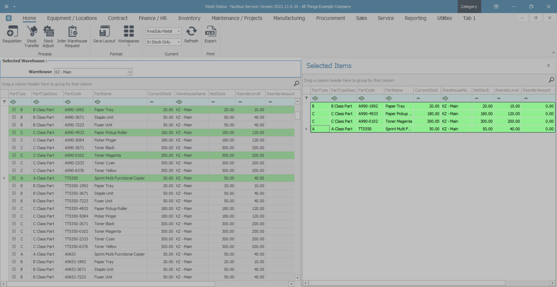
Select Multiple Item Lines - Nonsequential order
- Select the first row in the block that you wish to move.
- Press and hold the Control button on your keyboard.
- Using your mouse, click on each individual line that you wish to move.
- Still pressing the Control button, click in the row selector column of the final row of your selection and drag and drop the whole block to the second grid.
- The nonsequential selection of item lines is now reflected in the Selected Items frame
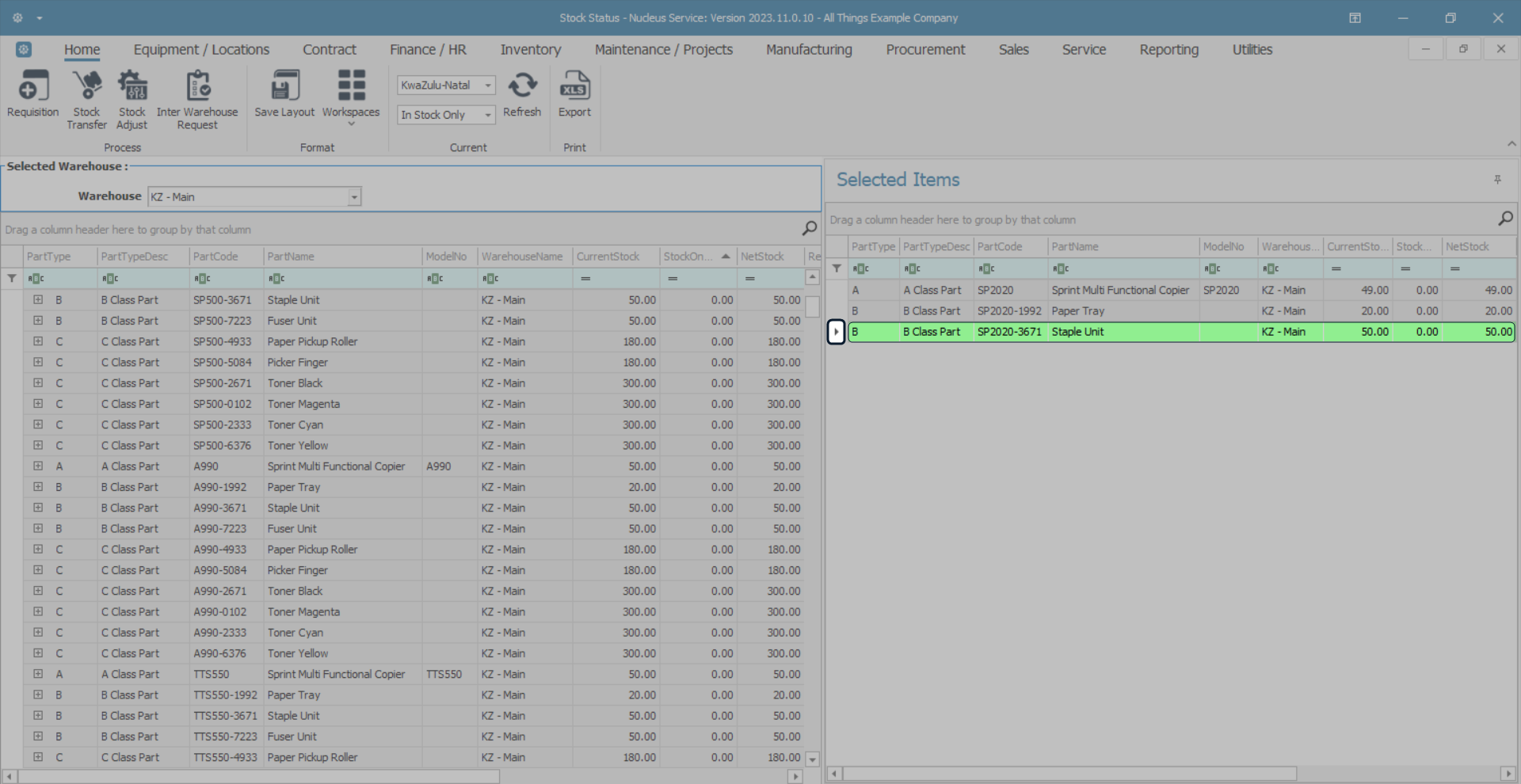
Undo Item Line Move
- Any item line move can be undone by reversing the processes above and moving either a single item line or multiple item lines back to the first data grid.
Important Note: A row (item line) must be dragged from the row selector column. You cannot select and drag from anywhere else in the row.
Sorting Data Columns
You may wish to reorganise (sort) the contents of a data column in the grid that you are working in.
- Click on the column header.
- In this image Part Code has been selected.
- A Sort button will be revealed, the direction it is pointing depends on the way it will sort the column.
- If you click on the sort arrow when it points down, the column will sort in ascending order.
- If you click on the sort arrow when it points up, the column will sort in descending order.
- In this example, the Part Code column data has been sorted in ascending order.

Search for Data - the Filter Button
- As you hover over a column header cell, the Filter button will appear.
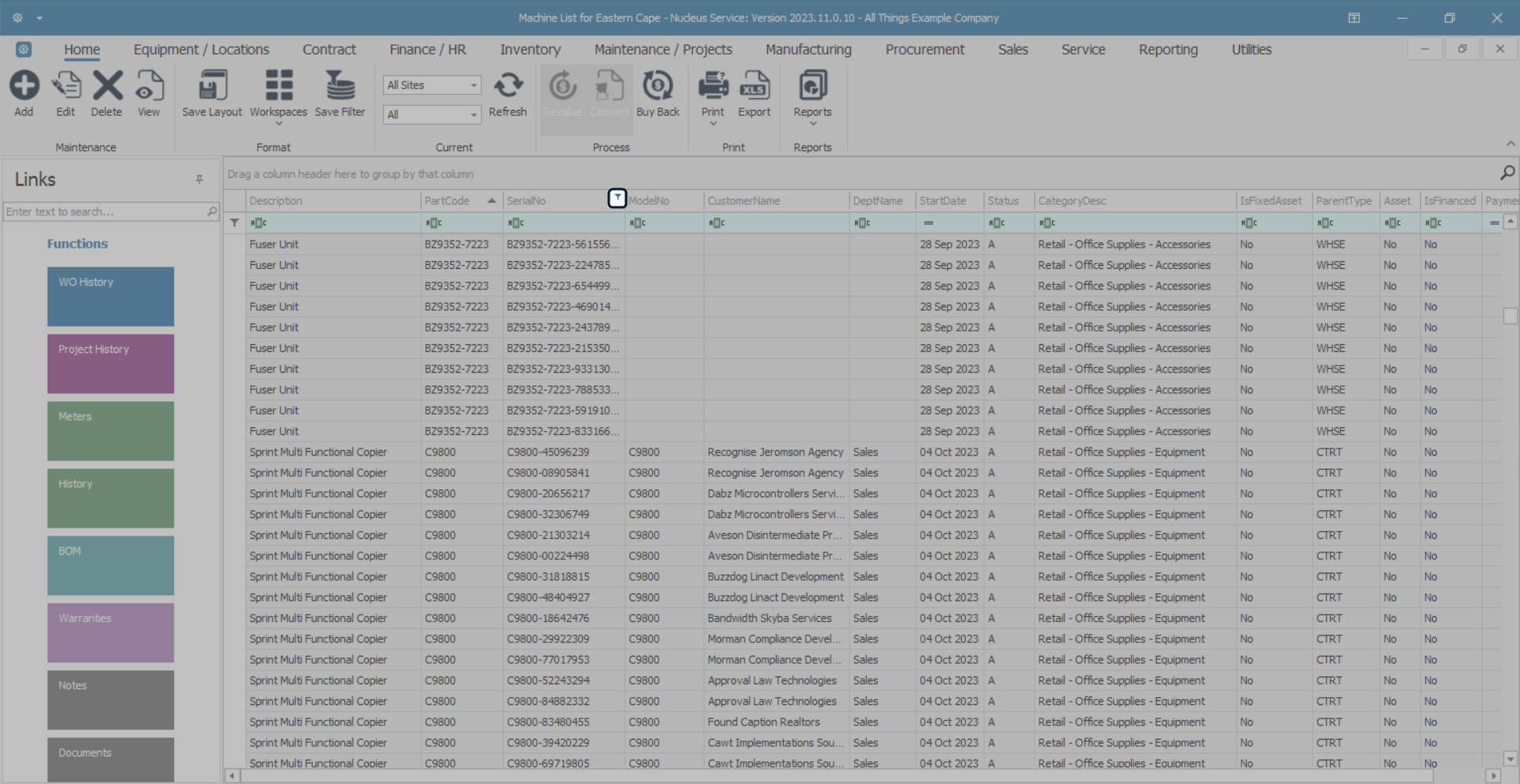
- When you click on this button, a Custom drop-down list will be displayed, the contents of which depend on the column header selected.
- This will be a quick reference list of all the different numbers (or names) in that column.
- Click on any number (or name) in the list.
- In this image, the part code number A300-1992 has been selected.
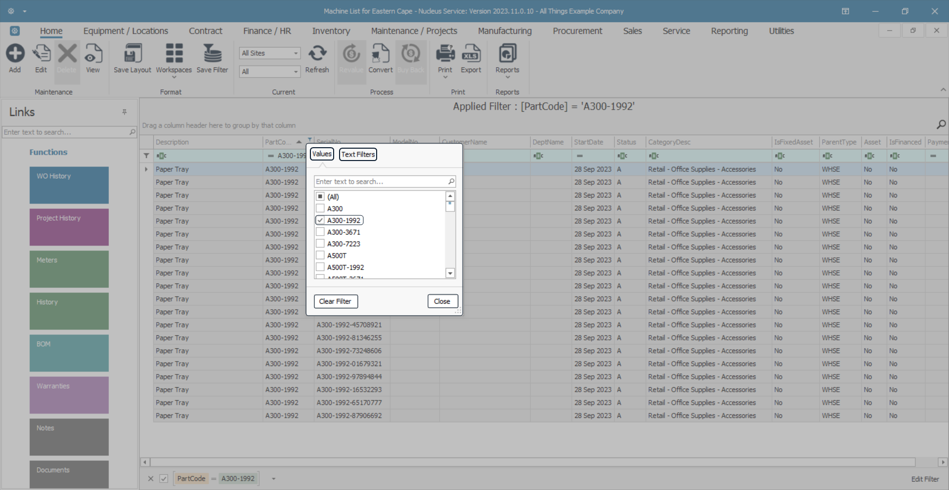
- The system will filter your selection in the data grid and the Auto Filter row of the Part Code column will contain the number (or name) that you selected.
- The Title row and Edit Filter row will also display the filter selection.
Data grid filtering is covered in more detail in the Data Grid Filtering manual.
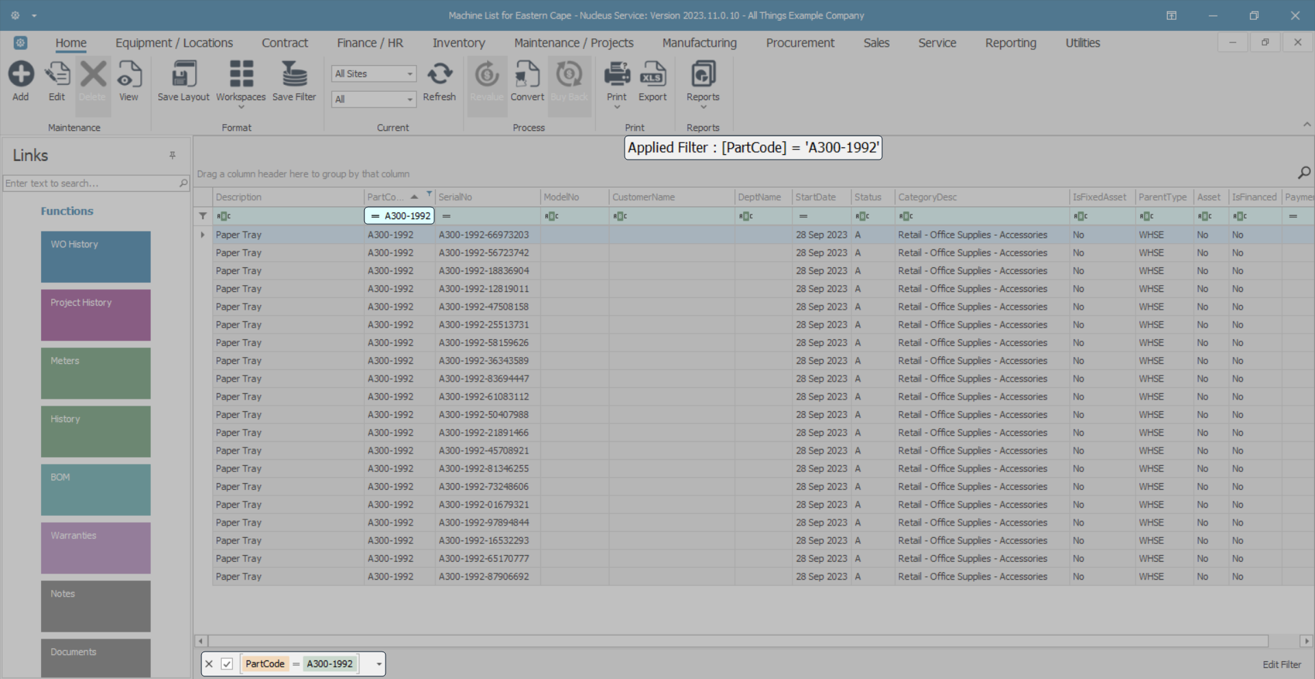
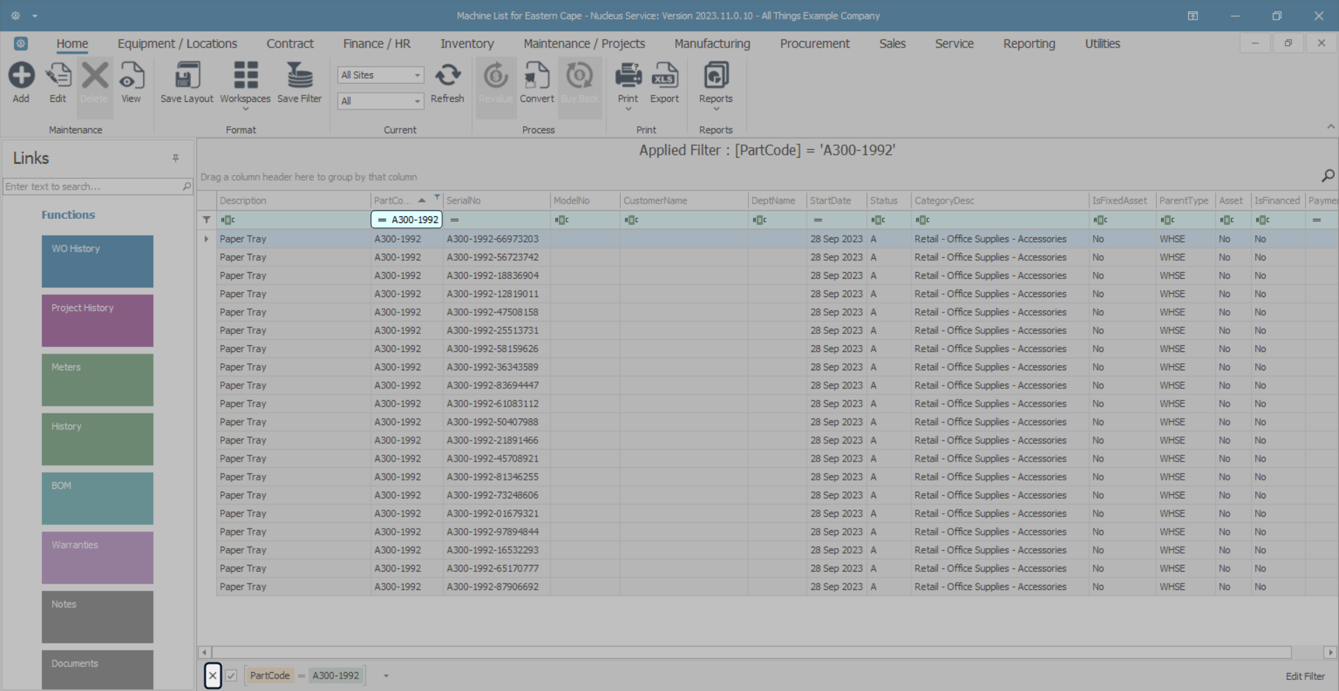
Clear a Search
- Either - remove all text from the Auto Filter row,
- Or, click on the [X] in the Edit Filter row, to remove the filter(s).
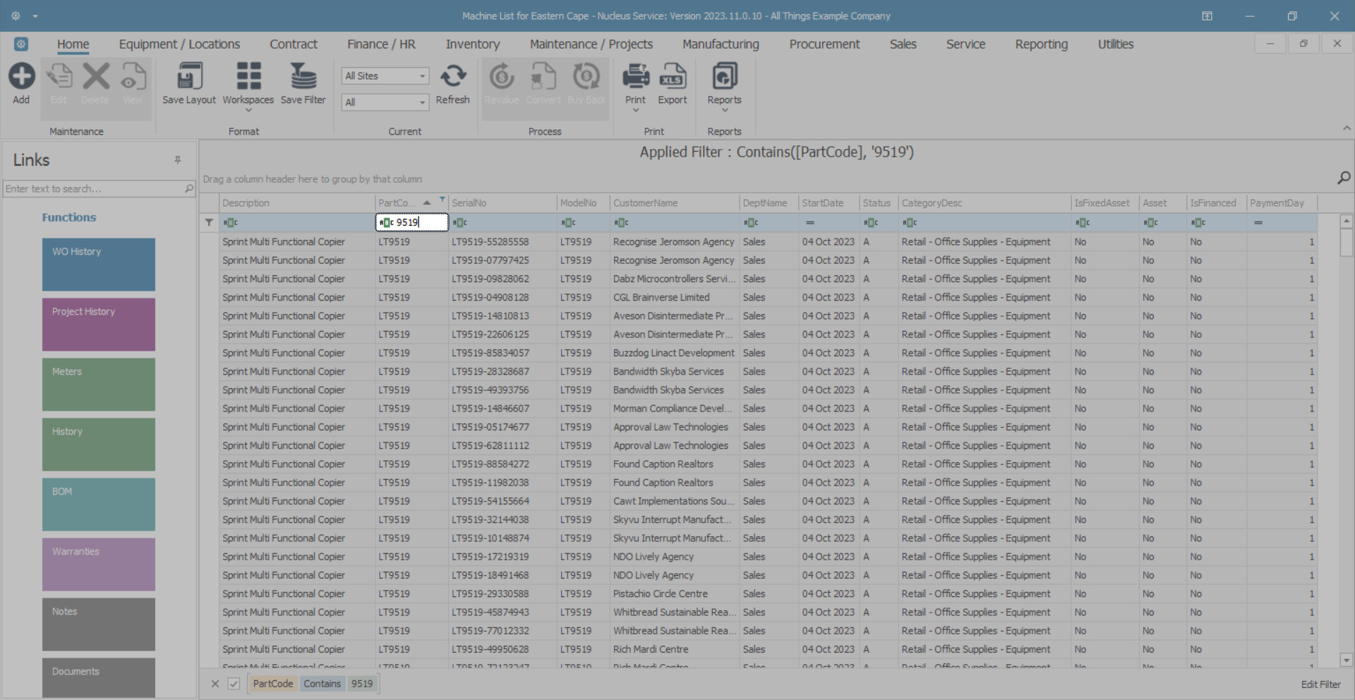
Search for Data - Auto Filter Row
- Type the data you are searching for in the Auto Filter row of the column where you wish to search for data.
- In this image, the applied filter is for a Part Code that contains the numbers 9519.
- The system will immediately start filtering for the first number / letter as you type it.
- Note 1: The filter is not case sensitive.
- Note 2: You can type any part of a word or number.
Data grid filtering is covered in more detail in the Data Grid Filtering manual.
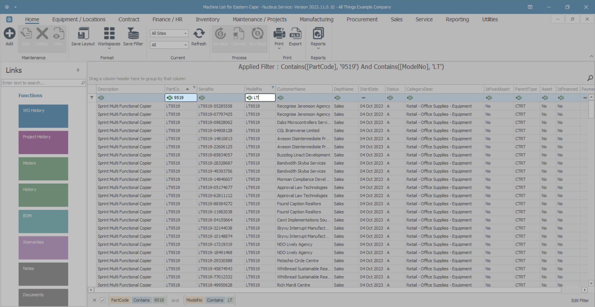
Search for Data - Multiple Searches
- If you want to search in more than one column, then do not remove the first filter selection.
- Type the new search data in the filter row in the next column of choice.
- In this image the first filter is for Part Codes containing the numbers 9519.
- The second filter is for Model Numbers containing the letters LT.
Clear Multiple Searches
- Either, remove all text from the Auto Filter row,
- Or, click on the [X] in the Edit Filter row to remove the filter(s).

Column Width
You can change the width of the columns within a data grid.
- Click and hold on the line between two columns in the column header row.
- White double ended arrow heads will appear and the dividing line between the columns will be highlighted.
- Move the mouse either left or right to increase or decrease the column width.

This is covered in more detail in the Data Grid Layouts manual.
Save Layout
- When you are happy with the data grid changes, click on Save Layout to save the changes made.
Export Data
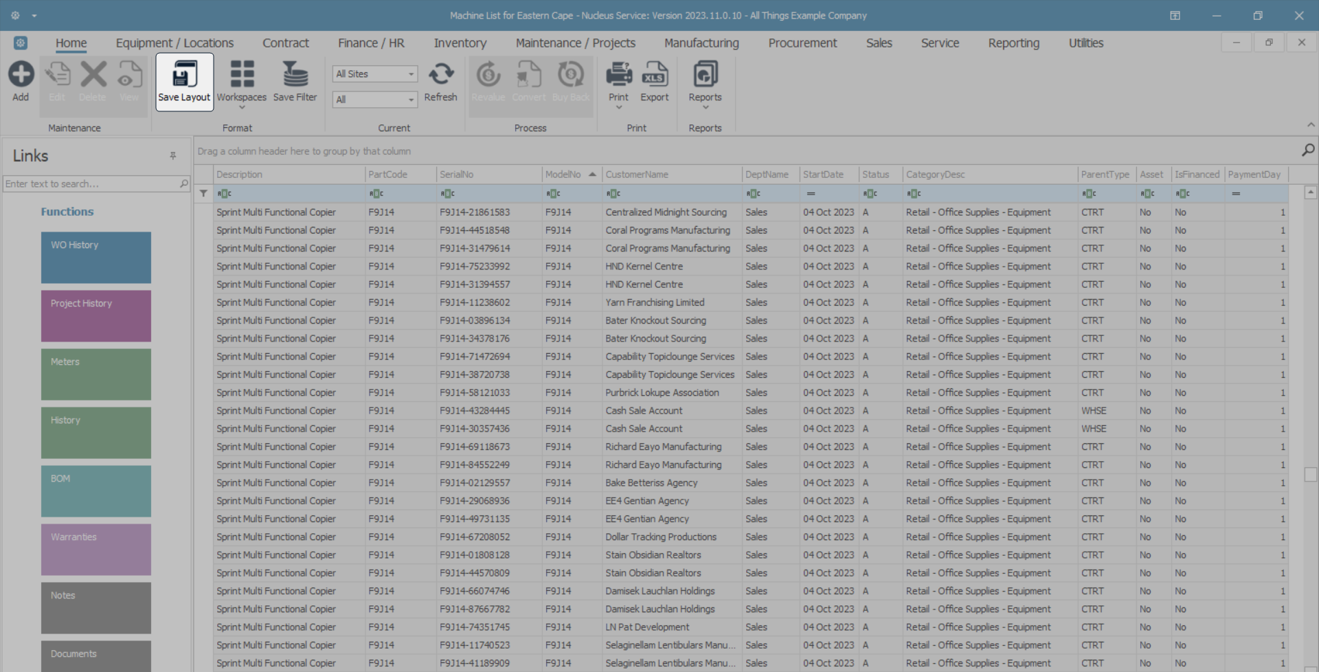
You can use the Export button to export the data grid information to Excel.
- Click on a Column Header to quickly sort the data in Ascending or Descending order.
- In this image, the data grid has been sorted by Description in Ascending order.
- Click on the Export action button.
- This will open Excel with a new spreadsheet and load all the data from the data grid into that spreadsheet.
- You can then view the data, search for data, prepare the spreadsheet for printing, etc.
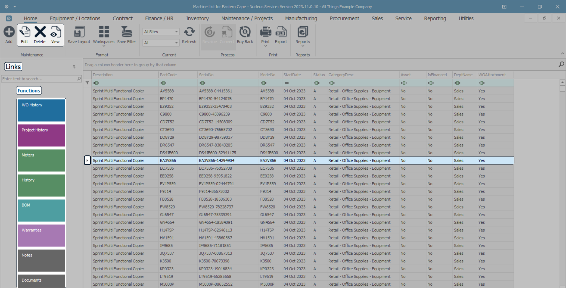
Select a Row (Item)
- Click in the row selector column of the item you wish to work with.
- By selecting a row (or item), you can do various things:
- Utilise the Functions Tiles in the Links panel.
- Edit, Delete, or View the item.
- Note 1: There are only certain screens where items can be deleted.
- Note 2: When an item is deleted, it will still be within the database, but it will be set to inactive and therefore not viewable to users any more.
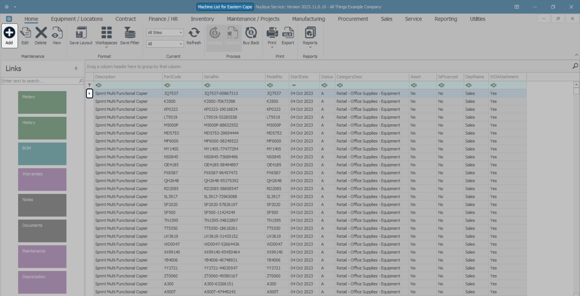
Add an Item
- Where there is more than one data grid, click on the data grid where you wish to add a new record to.
- The row selector will indicate where you are in the data grid.
- Click on Add to open the Maintain screen.
- You will need to load the data as required before saving.
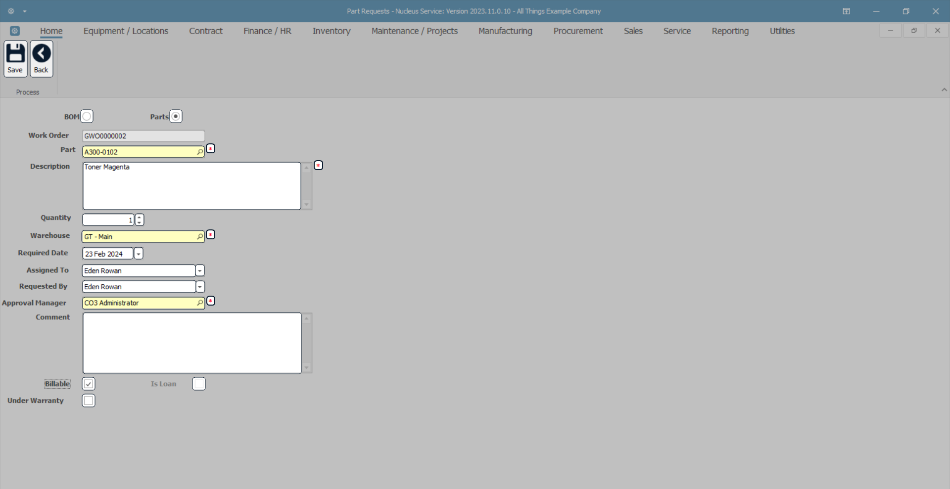
Maintain Screen Overview
- Save: Click here to save the changes made to the screen.
- Back Click here to return to the previous screen without saving any changes.
- Radio Buttons: Click on the button that will enable you to select from a specified range of data.
- Grey Search Text Boxes: These are uneditable. You cannot type into these boxes. There may be a search button which you can click on and select information from the lookup screen that will pop up.
- Yellow Search Text Boxes: Either type in the data or click on the search button and select the data from the lookup screen. If you want to change the details already populated in the yellow box, clear the field (remove the text in the text box) and start the search again.
- White Text Boxes: Are for you to type in data or click on the drop-down arrow to reveal a drop-down menu to select from.
- Date Fields: Either type in or click on the drop-down arrow and use the calendar function to select the date.
- Check Boxes: Click in the check box to select the item or clear the check box (click on it again) to remove the selection.
- [ * ]: Denotes mandatory fields.
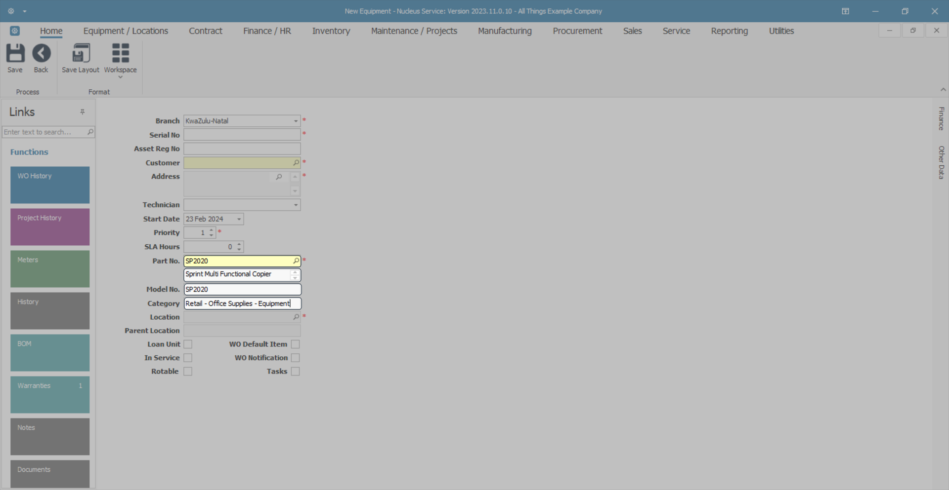
Lookup Screen
Lookup screens give you a list of information that you can link to the Maintain screen that you are busy populating.
- Click on the search button in either one of the grey or yellow text boxes.
- In this example I am searching for a part number to request from store.
- The relevant lookup screen will pop up. The details in this screen will be linked to the search instigated.
- In this example, the search was initiated in the Part No. text box therefore the lookup screen contains a list of parts to select from.
- Either select the row and click on Ok or double click on the selected row.
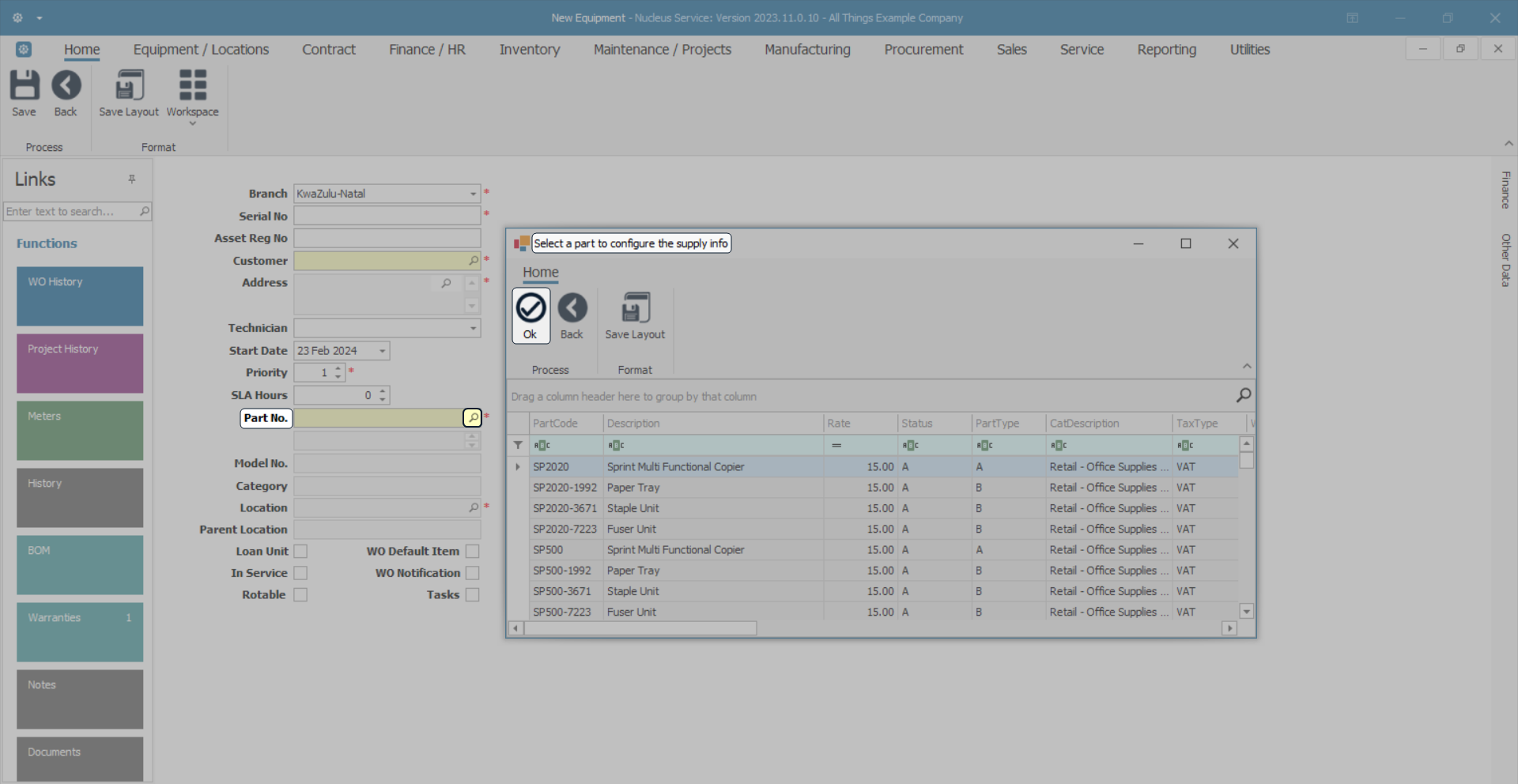
- The selected details will populate the fields linked to the text box that you initiated the search in.
MNU.000.004