We are currently updating our site; thank you for your patience.
Interface and Environment
Using Nucleus Service - Data Grid Layouts
- What is a Data Grid?
- A data grid is an area which holds data for you to view. It is structured much like an Excel spreadsheet, which shows details in rows and columns.
- Nucleus Service Data
- Data is a set list of information that has been entered into the system, and can include many things depending on which screen you are in.
- Data grid columns can be customized by user group.
Auto vs Manual Refresh
By default, all listing screens in Nucleus Service auto-refresh - meaning that each time a listing screen is opened or a record is added, viewed, updated or deleted, the full data set is retrieved. This functionality is maintained by setting the Company Configuration flag AutoRefreshLists to Yes.
For high volume environments, you have the option to set the AutoRefreshLists Company Configuration flag to No. This means that only affected data will be refreshed.
With both options, the listings can still be manually refreshed at any point.
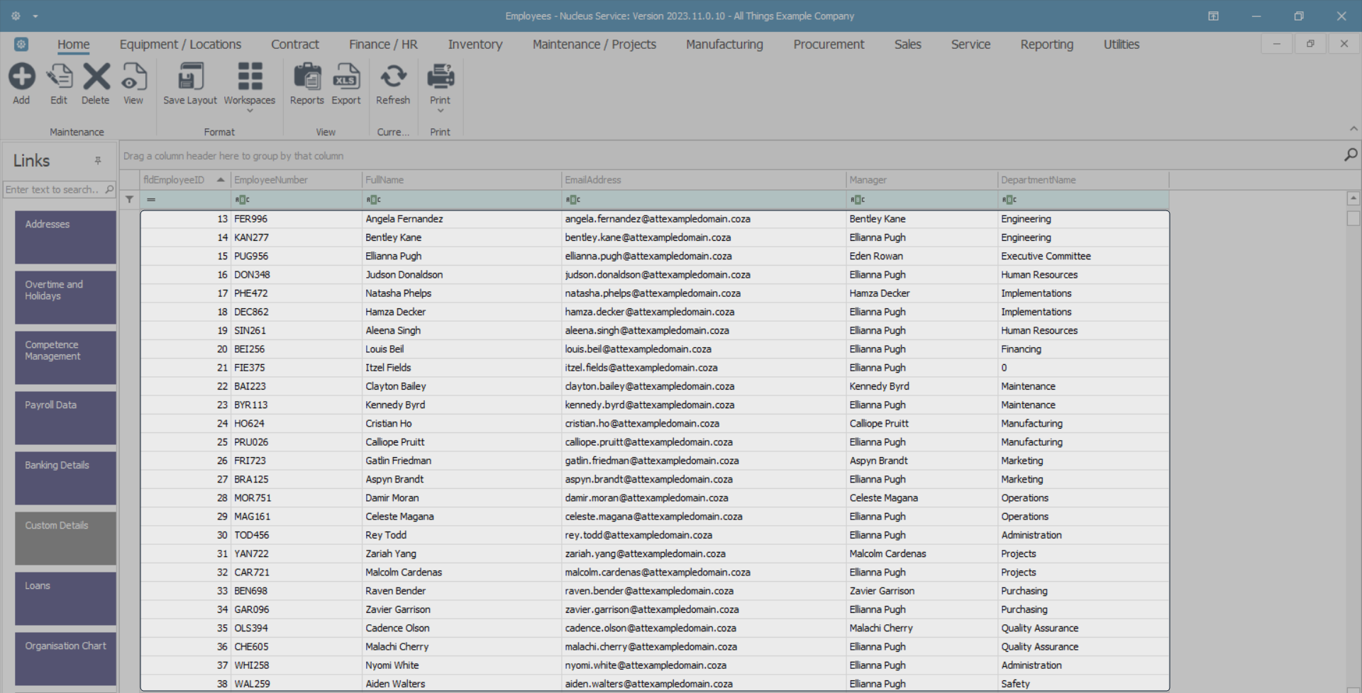
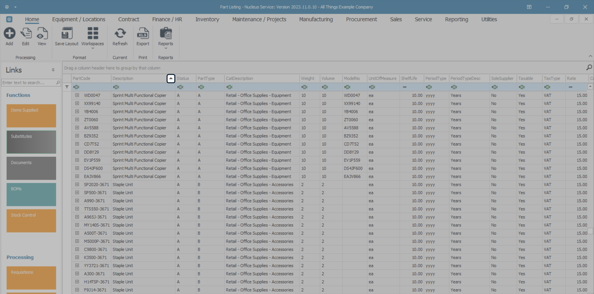
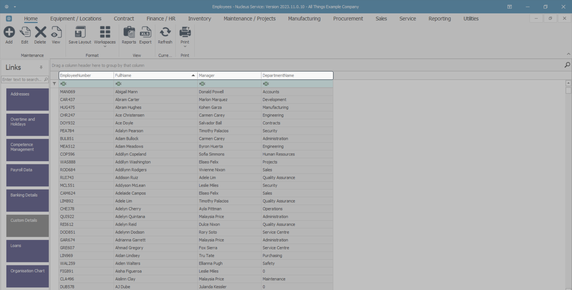
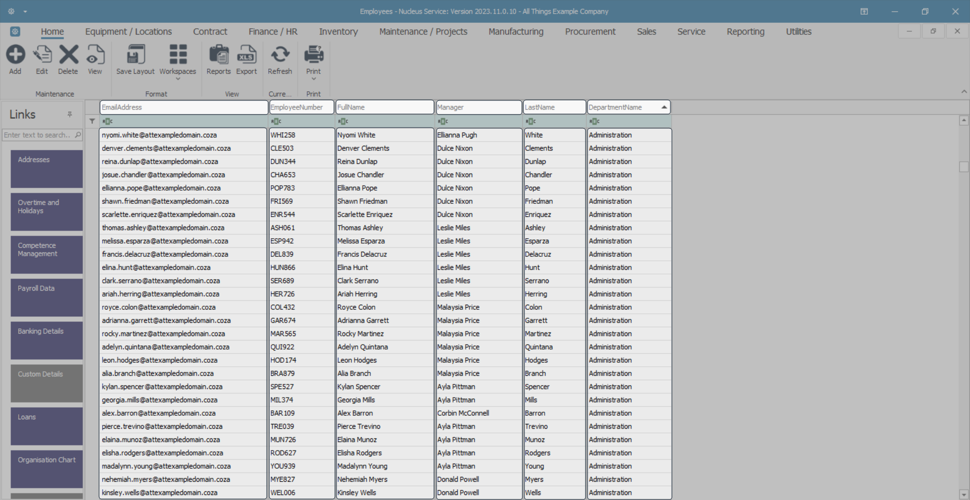
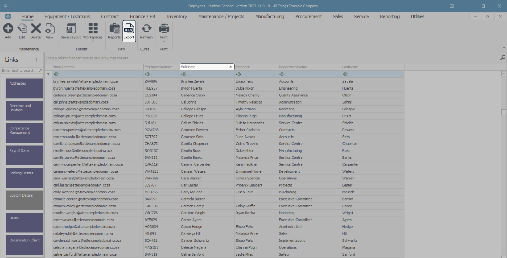
Data Grid Example
- The data grid in this image is displaying the list / rows of employees and columns of information relevant to each employee, for example: Employee ID, Employee Number, Full name, Email Address, Manager, Department Name.
Rows and Columns
Row Selection
- A row is selected by clicking in the row selector column at the beginning of the row.

- The selected row is indicated by an arrow in the row selector column.
- If you click in any field of a row, the selected field will be highlighted and the whole row remains selected.
Note: Some rows in Nucleus Service can be selected by clicking anywhere in the row, as in the above example, but some rows can only be selected by clicking in the row selector column at the beginning of the row.
The Column Header
- A Column Header indicates the type of data listed in the column below it.
Multiple Data Grids in a Screen
- Some screens have more than one data grid.
- For the system to know which data you wish to work with, click anywhere in that specific data grid.
Sorting Data Grid Information
The Sort Icon
- Click in any column header cell to display the Sort icon.
- Click on the column header icon to quickly sort the data in that column into either Ascending or Descending order.
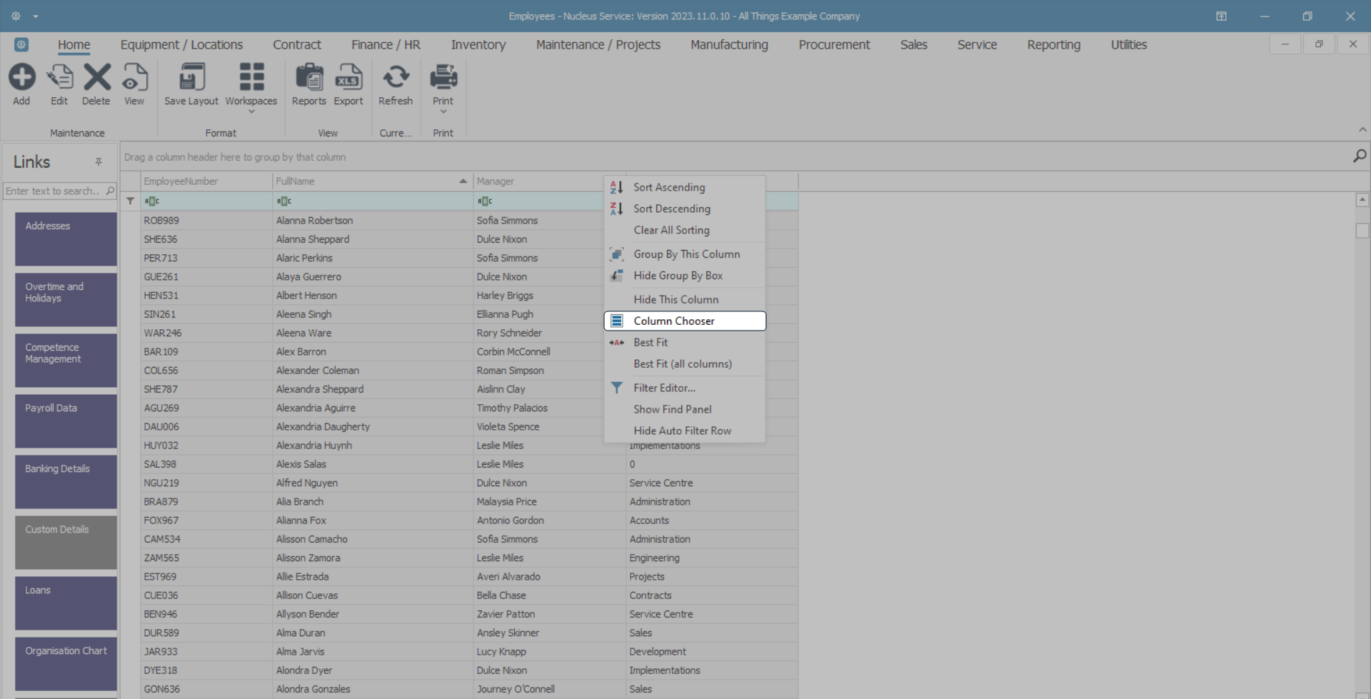
The Sort / Filter Drop-Down Menu
- You can also right-click in any column header cell to reveal a drop-down menu.
- This menu is divided into 4 sections.
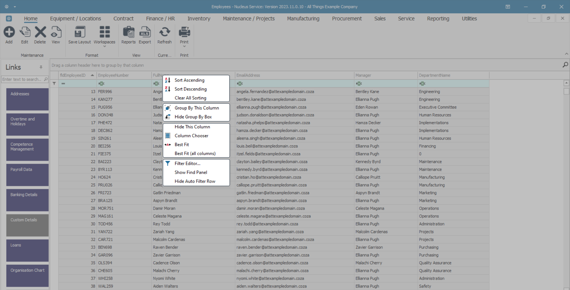
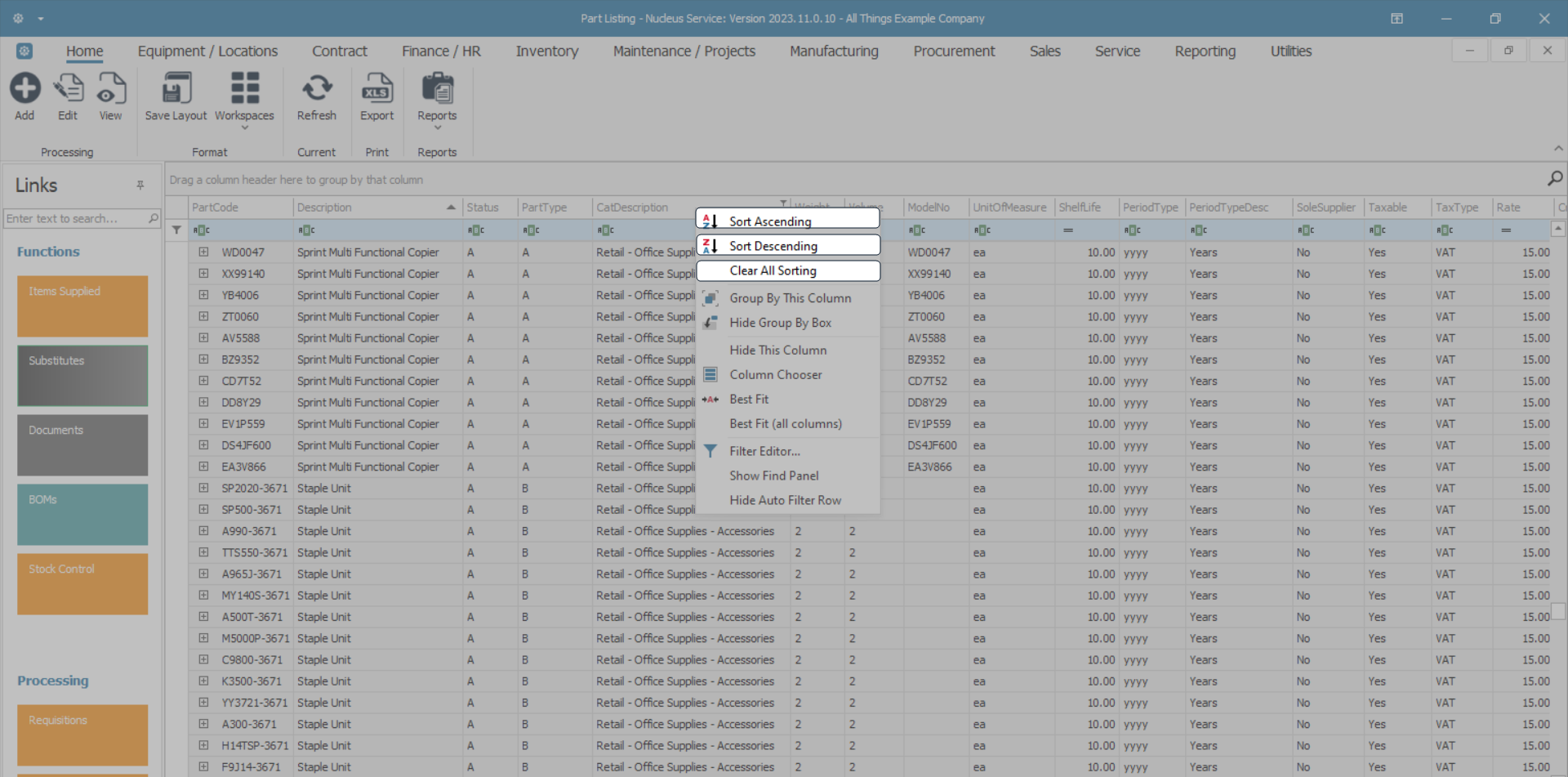
Sorting / Clear Sorting
- The first section gives you the options to sort in either Ascending or Descending order as well as a Clear Sorting option.
Grouping Columns
- The second section of the drop-down menu is devoted to Grouping the columns.
- In the column header of your choice, right click to display the drop-down menu, then click on the Group By This Column option.
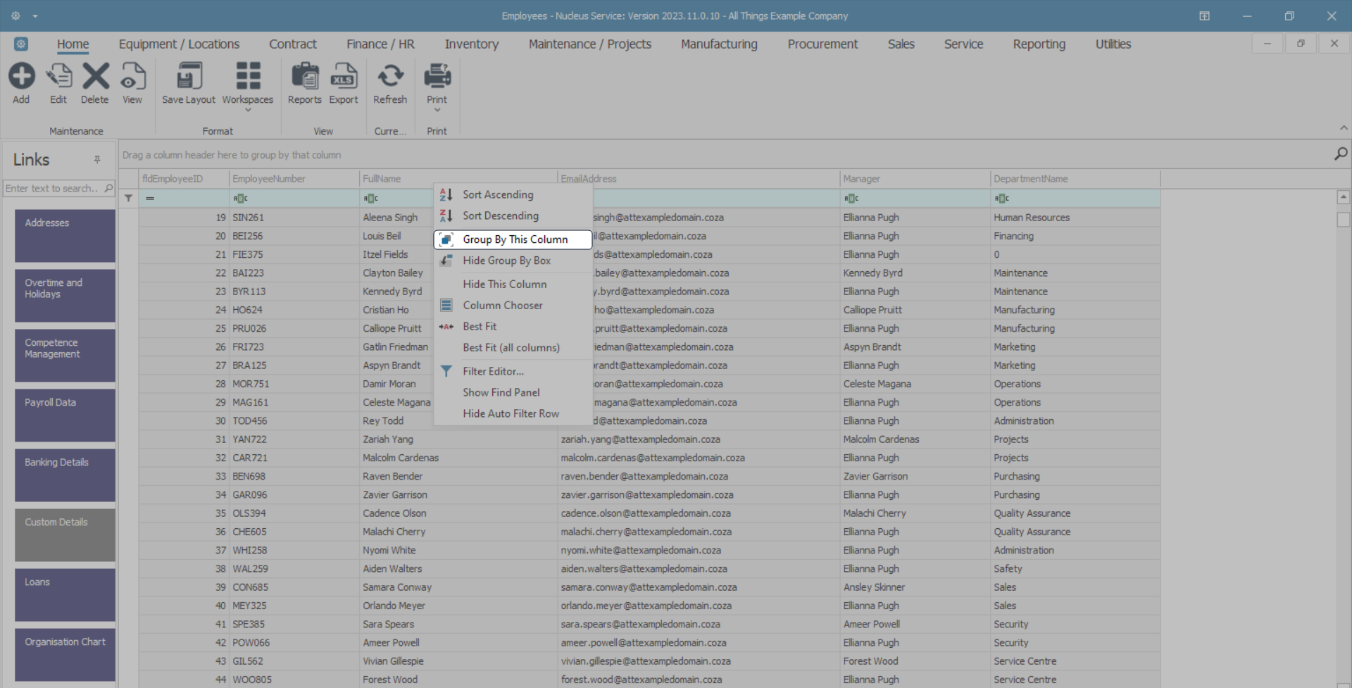
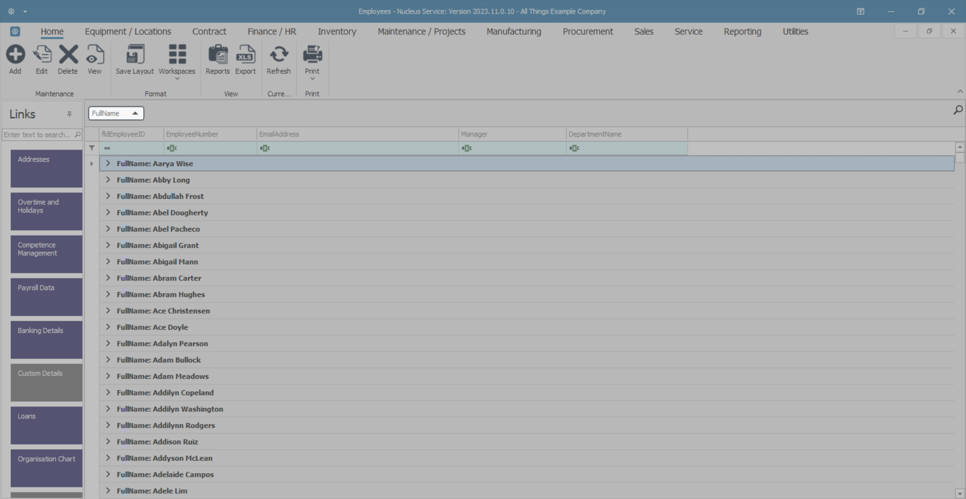
- The data grid will now display the results of your Group By This Column choice.
- The Group By box above the column will now display which column has been grouped.
- In this image, the data grid has been grouped by the FullName column.
- You can achieve the same results without using the drop-down menu.
- Simply click and hold on the column header of your choice.
- As you drag your mouse up and away from the original column header position, two blue arrows will appear directing you to the Group By box.
- Drop the column header in this box.
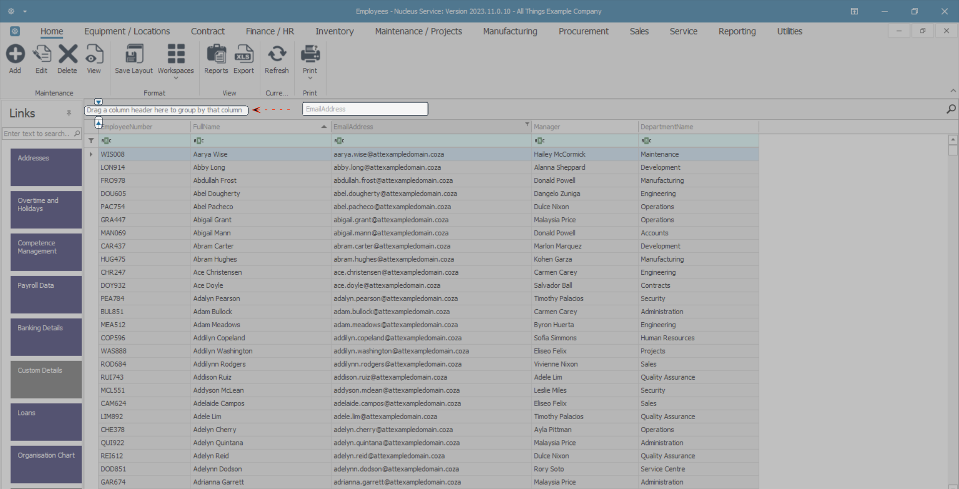
- The data grid will now display the results of your column grouping.
- The Group By box above the columns will now display which column has been grouped.
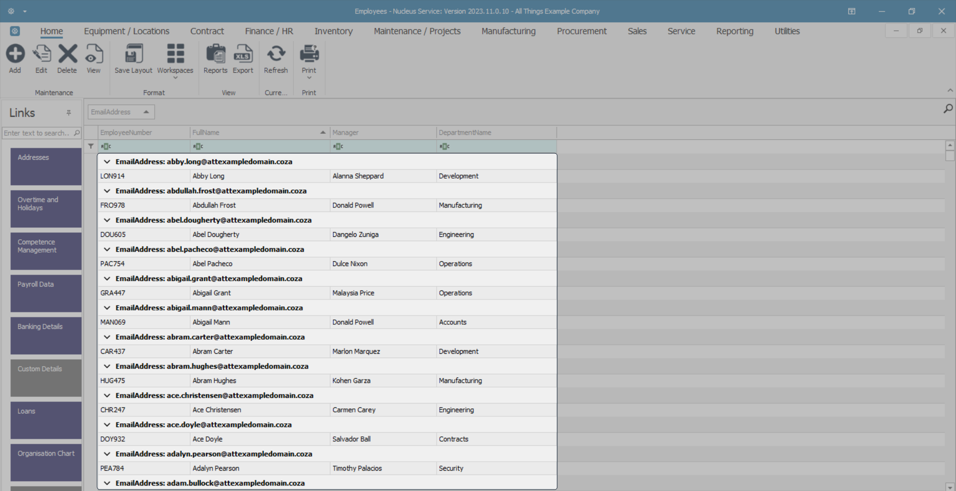
- In this image, the EmailAddress column has been grouped.
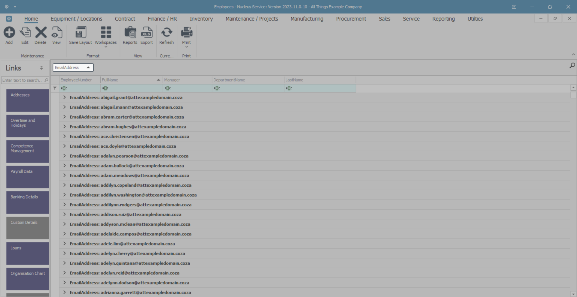
Expand View
- To view the information linked to grouped columns, Right click in the area to the right of the Group By box, not in the Group By box, to display a drop-down menu.
- Click on Full Expand.
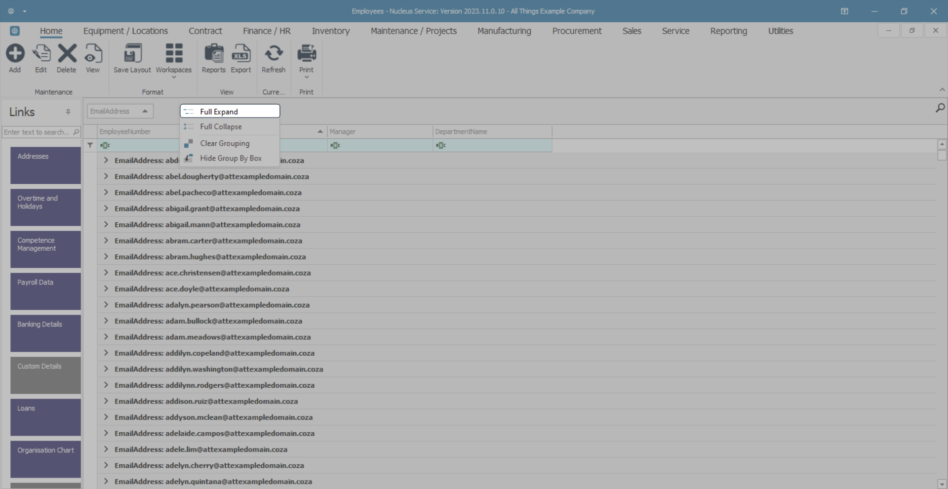
- The grid will display all linked information.
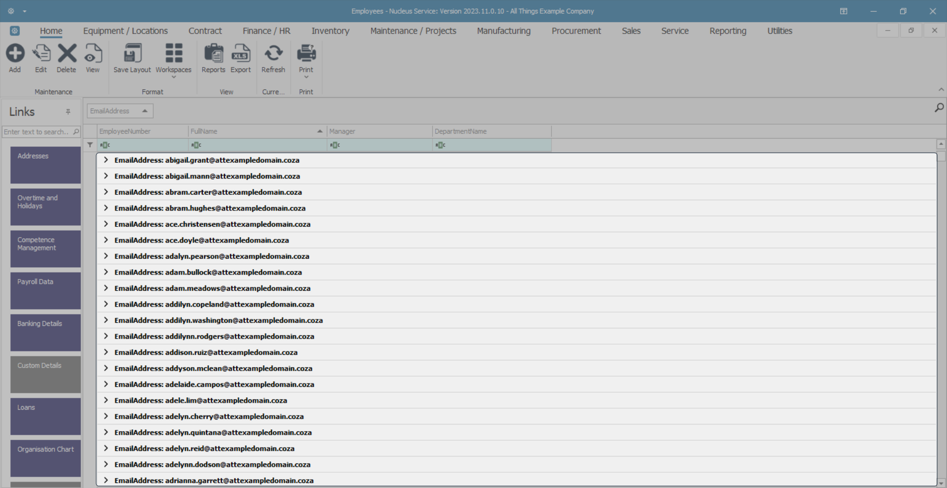
Collapse View
- Right click in the area to the right of the Group By box, not in the Group By box, to display a drop-down menu.
- Click on Full Collapse.
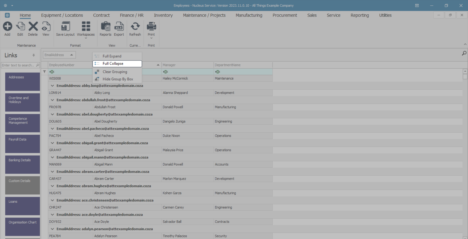
- The grid will return to the previous display.
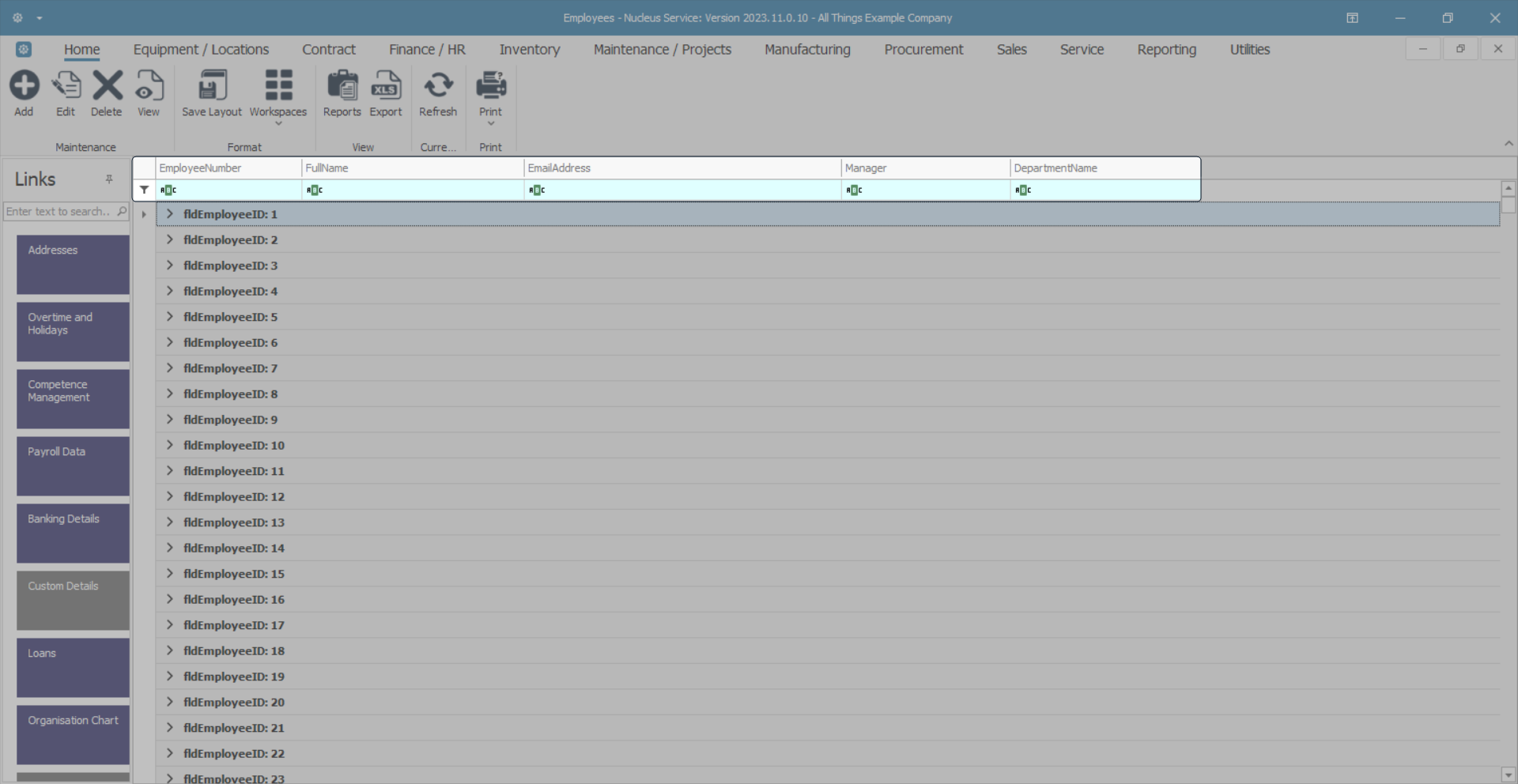
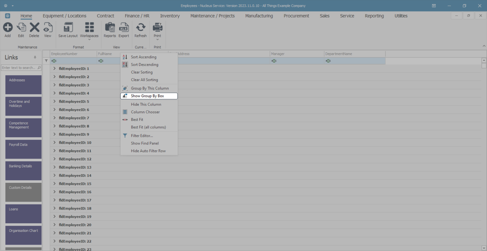
'Group By' Box
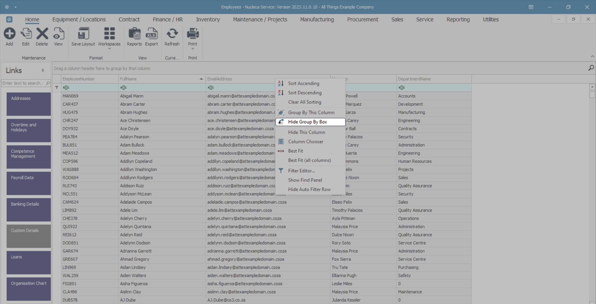
- Right click in any column header to display the drop-down menu, then click on the Hide Group By Box option.
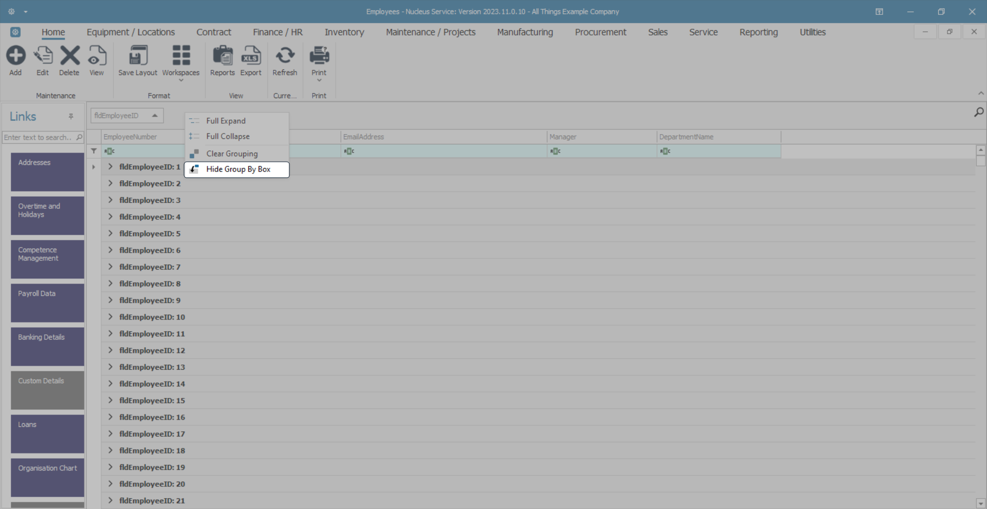
- The Group By box which is usually above the column header row is now hidden.
- To view the Group By box again, right click in any column header to display the drop-down menu, then click on the Show Group By Box option.
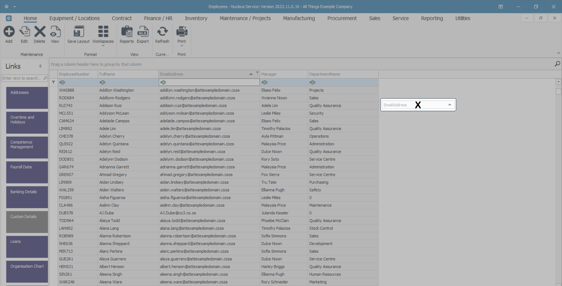
Hiding and Adding Columns
- The third section of the drop-down menu covers hiding, adding and sizing columns.
Method 1
- Right click in any column header to display the drop-down menu, then click on the Hide This Column option.
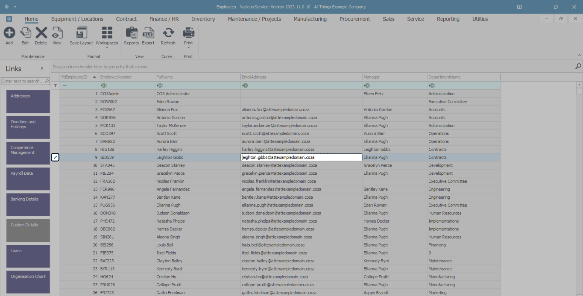
- In this image the EmailAddress column has been selected.
- The EmailAddress column has been hidden from the data grid.
Method 2
- You can also hide a column by clicking and dragging the column header down away from the column header row until a black X appears.
- Now 'drop' the column header.
- The column will be removed from the data grid.
- The column header can now be viewed in the Customization menu, ready to be added to the data grid again, if required.
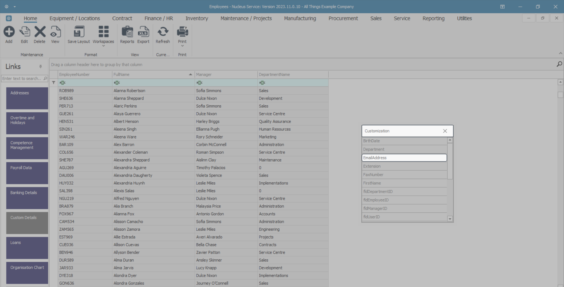
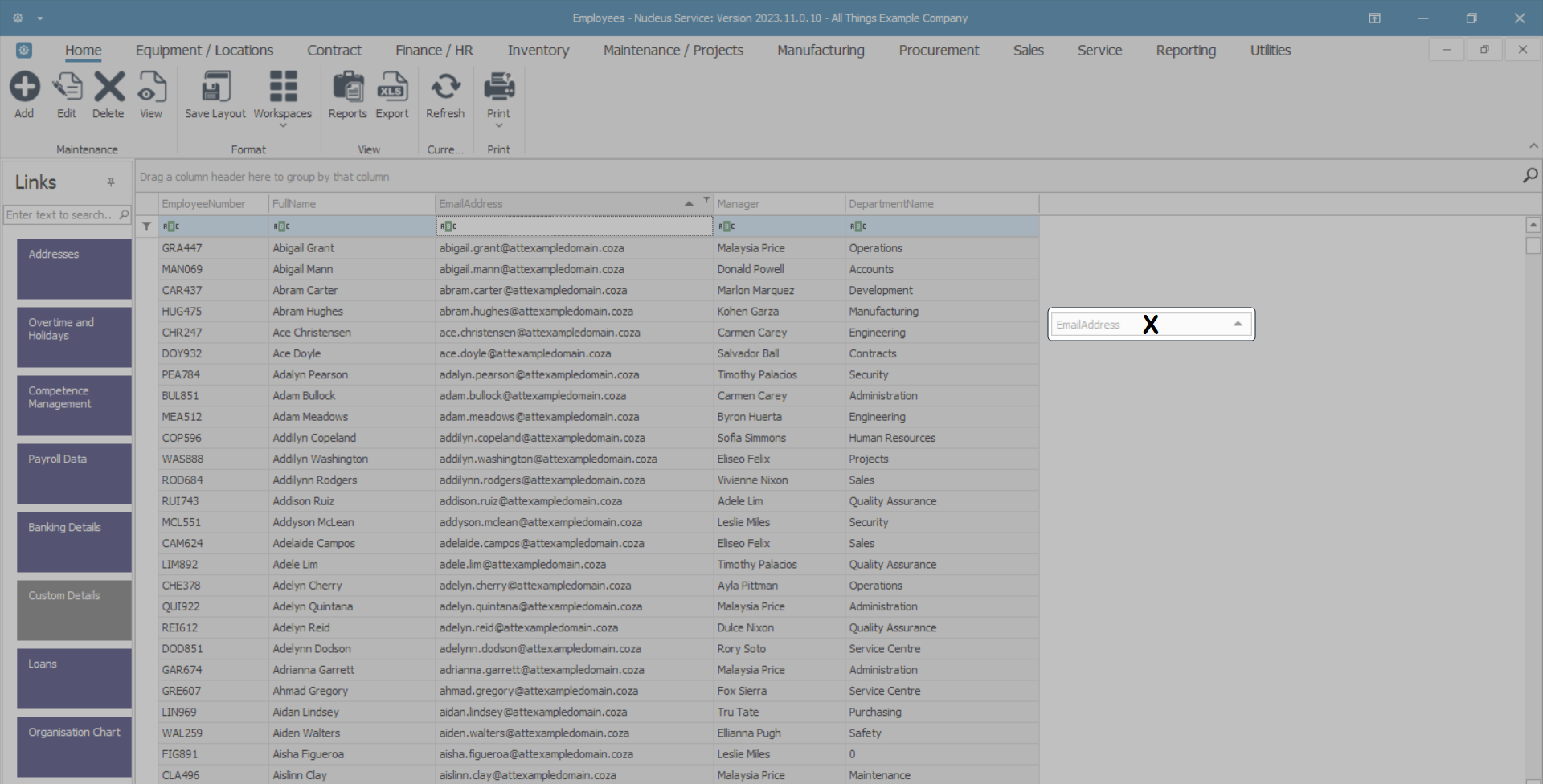
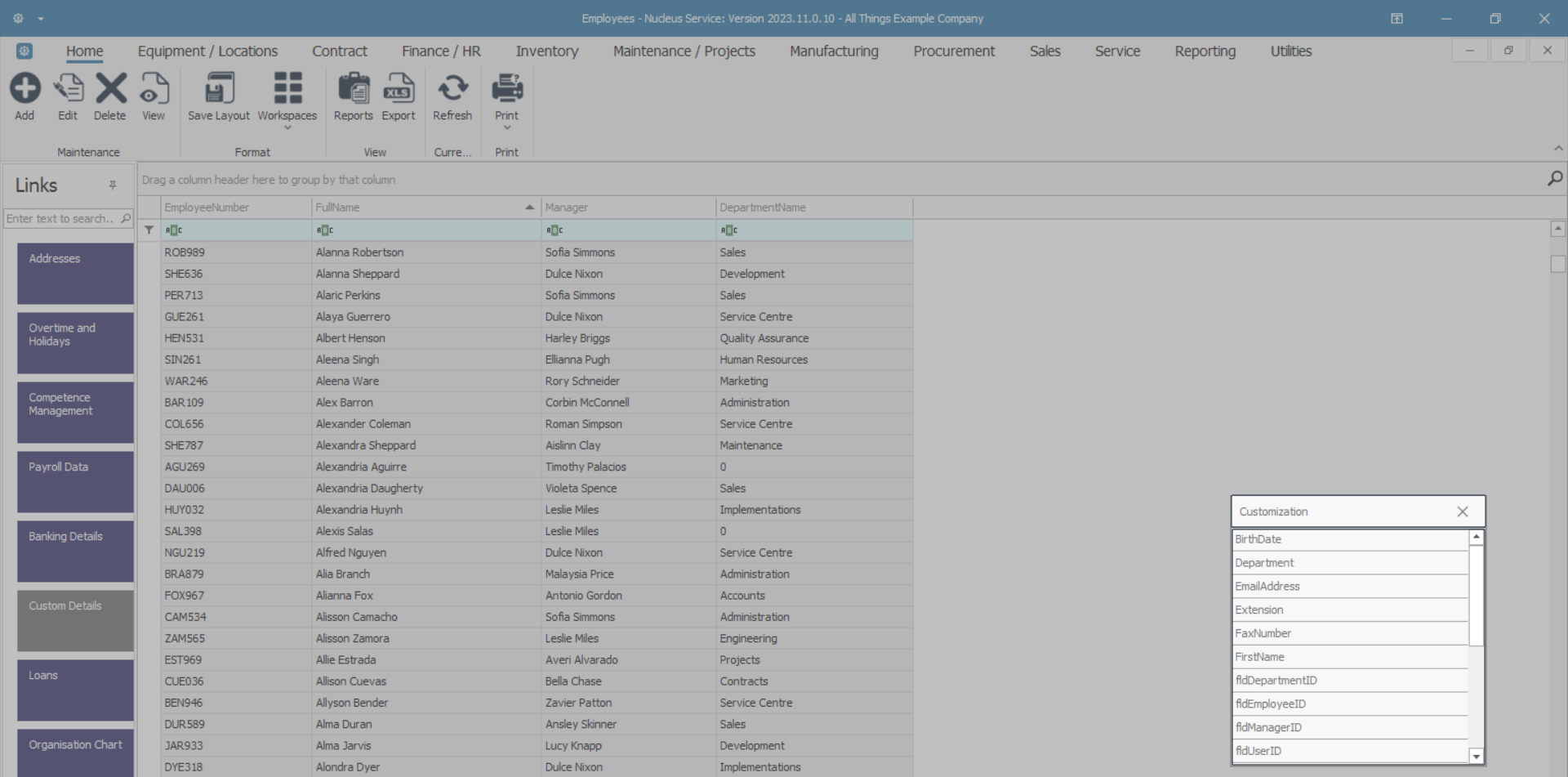
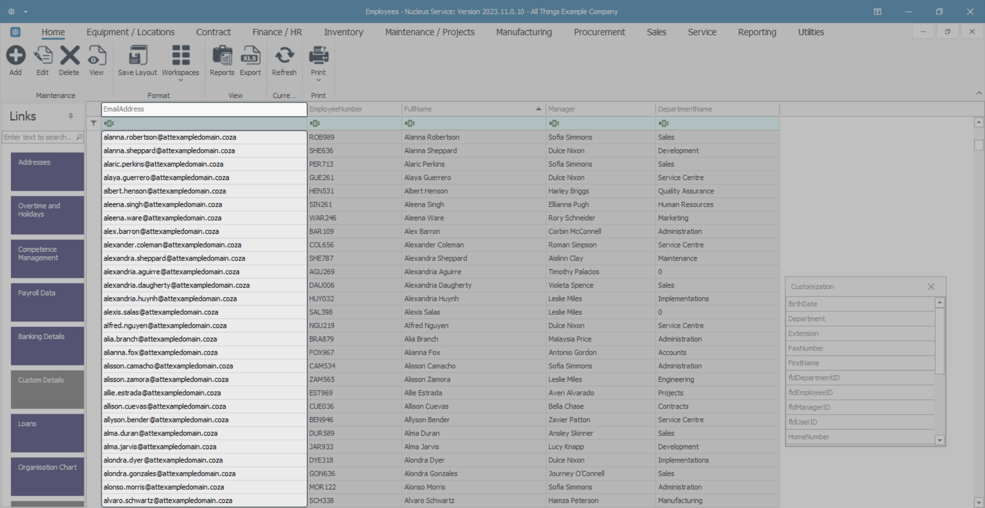
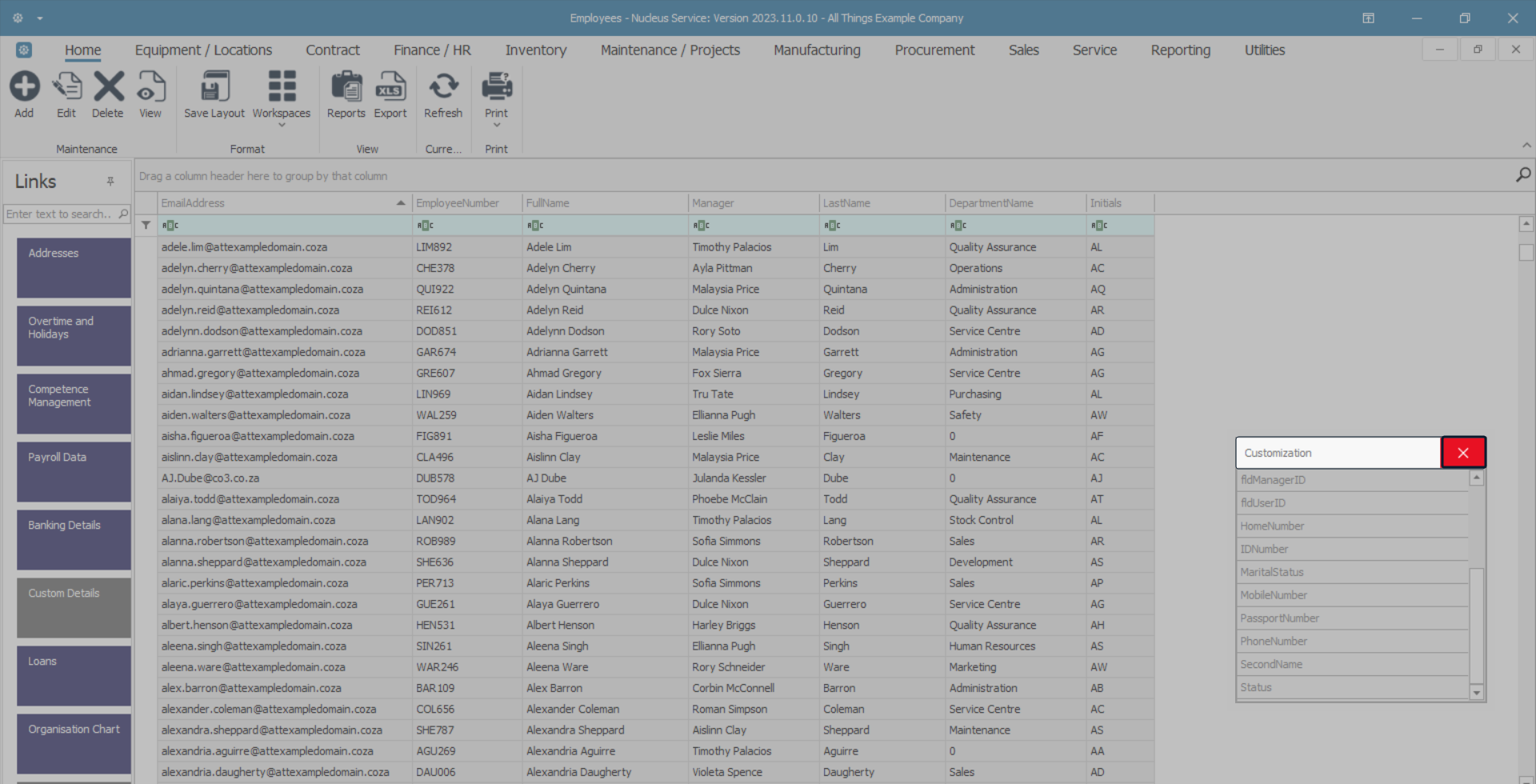
Column Chooser Customization Menu
- Right click in any column header cell to display the drop-down menu, then click on the Column Chooser option.
Customization List
- A Customization pop-up list will appear in the bottom right-hand side of the screen.
- This is an alphabetical list of the columns that you can add to your current data grid.
- Use the scroll bar to find the column header you want to add to your data grid.
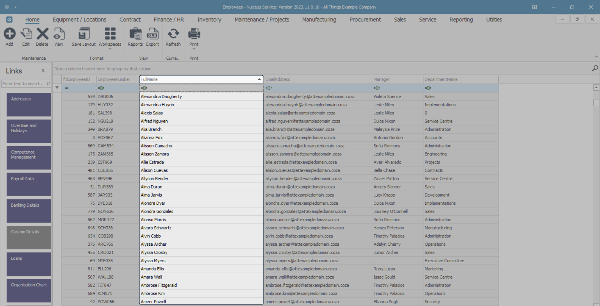
- Double click on the column header that you would like to add to your data grid.
- In this image the EmailAddress column header has been selected.
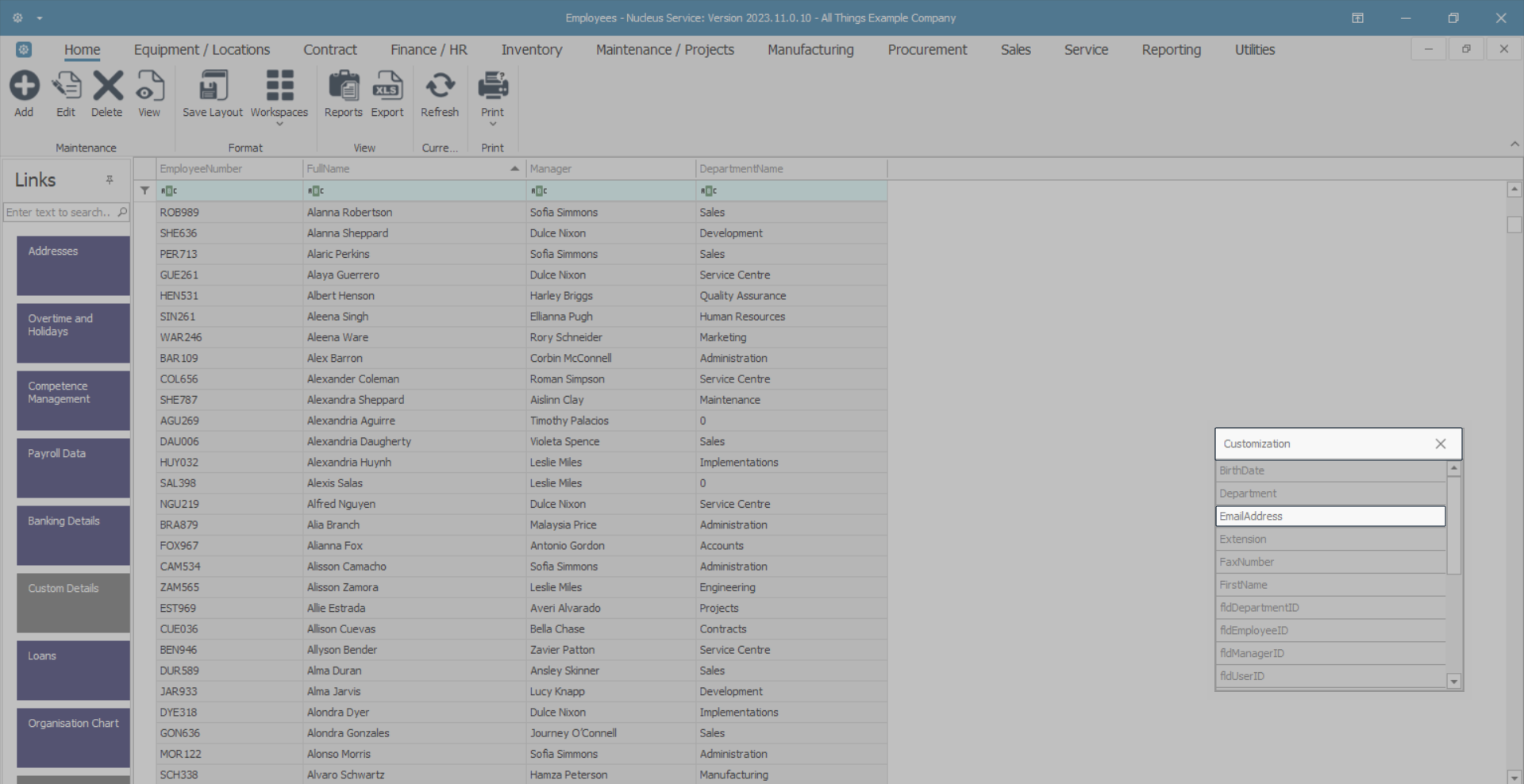
- A new column containing EmailAddress details has now been added to the data grid.
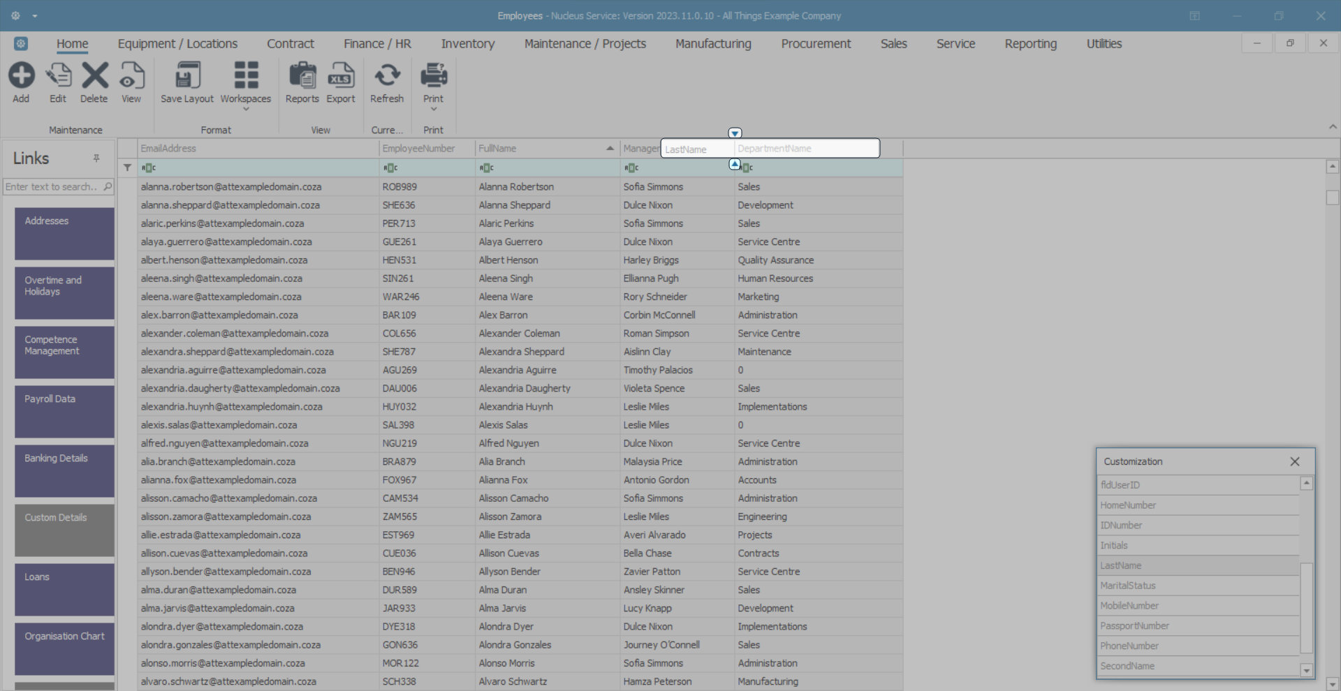
- A new column can also be added by clicking and holding on the column header of your choice in the Customization menu.
- In this image, Last Name has been selected.
- Now drag that header to the Column Header row and two directional arrows will appear indicating where to drop your selected header.
Note: You can drop this header anywhere in the column header row, in between any columns, at the beginning or at the end of the column header row, according to your preference.
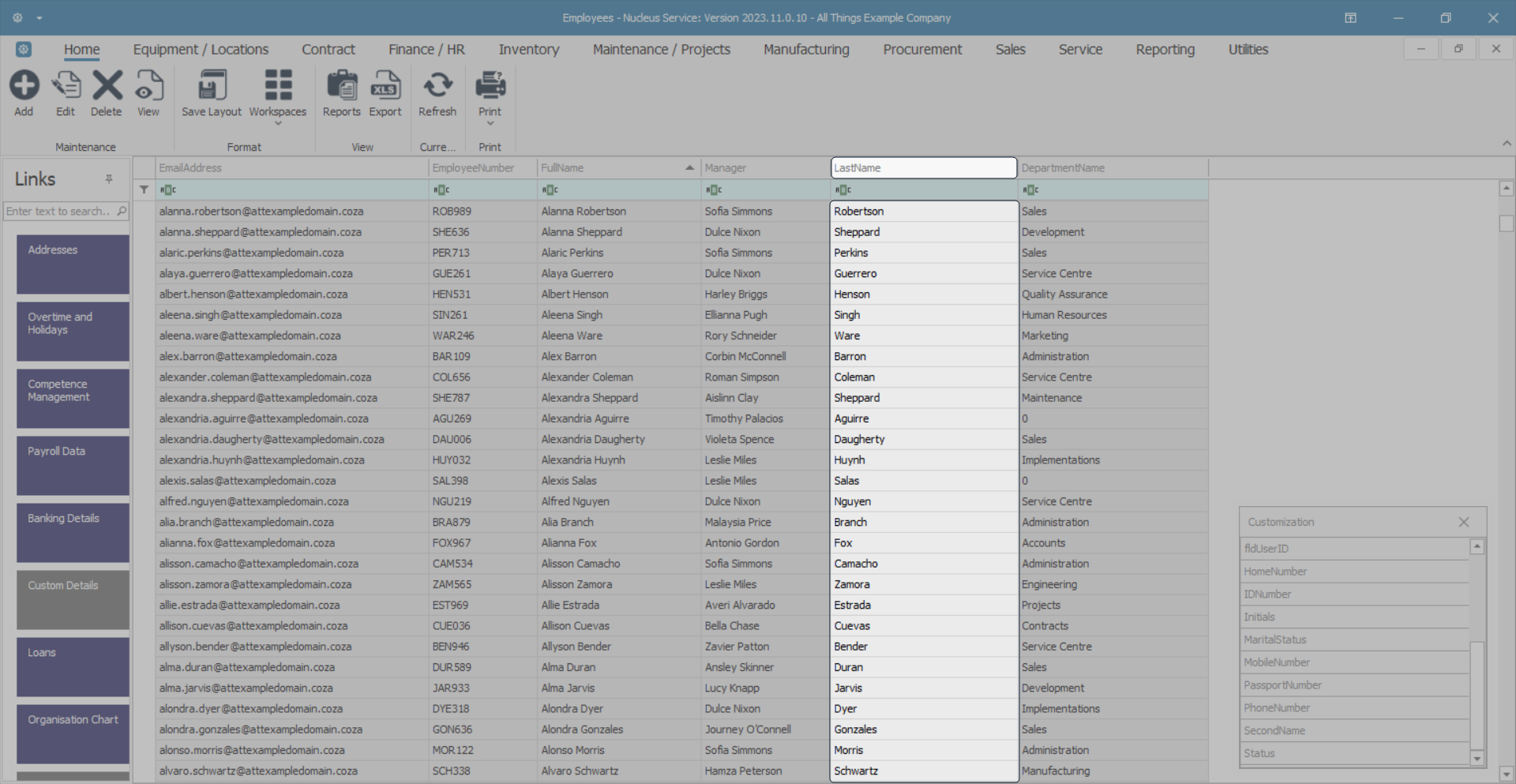
- The Last Name column header has been dropped between the Manager and DepartmentName columns.
- In this image, the Initials column header will be dropped at the end of the Column Header row.
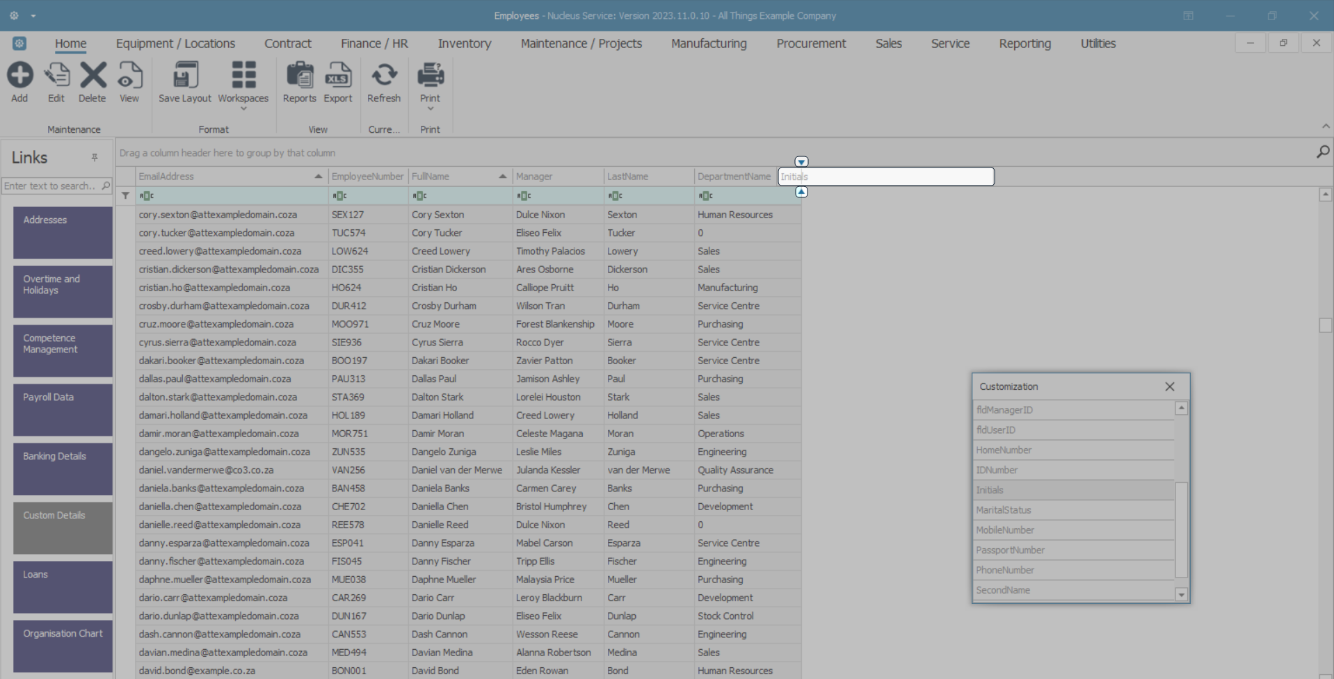
- You can now either repeat the process by 'selecting and double clicking' or 'dragging and dropping' another column from the Customization menu.
- Or you can close the Customization list by clicking on the Close icon in the menu.
- As you hover over this Close icon it will highlight red.
Sizing Columns - Best Fit (Single Column)
- Right click in any column header cell to display the drop-down menu, then click on the Best Fit option.
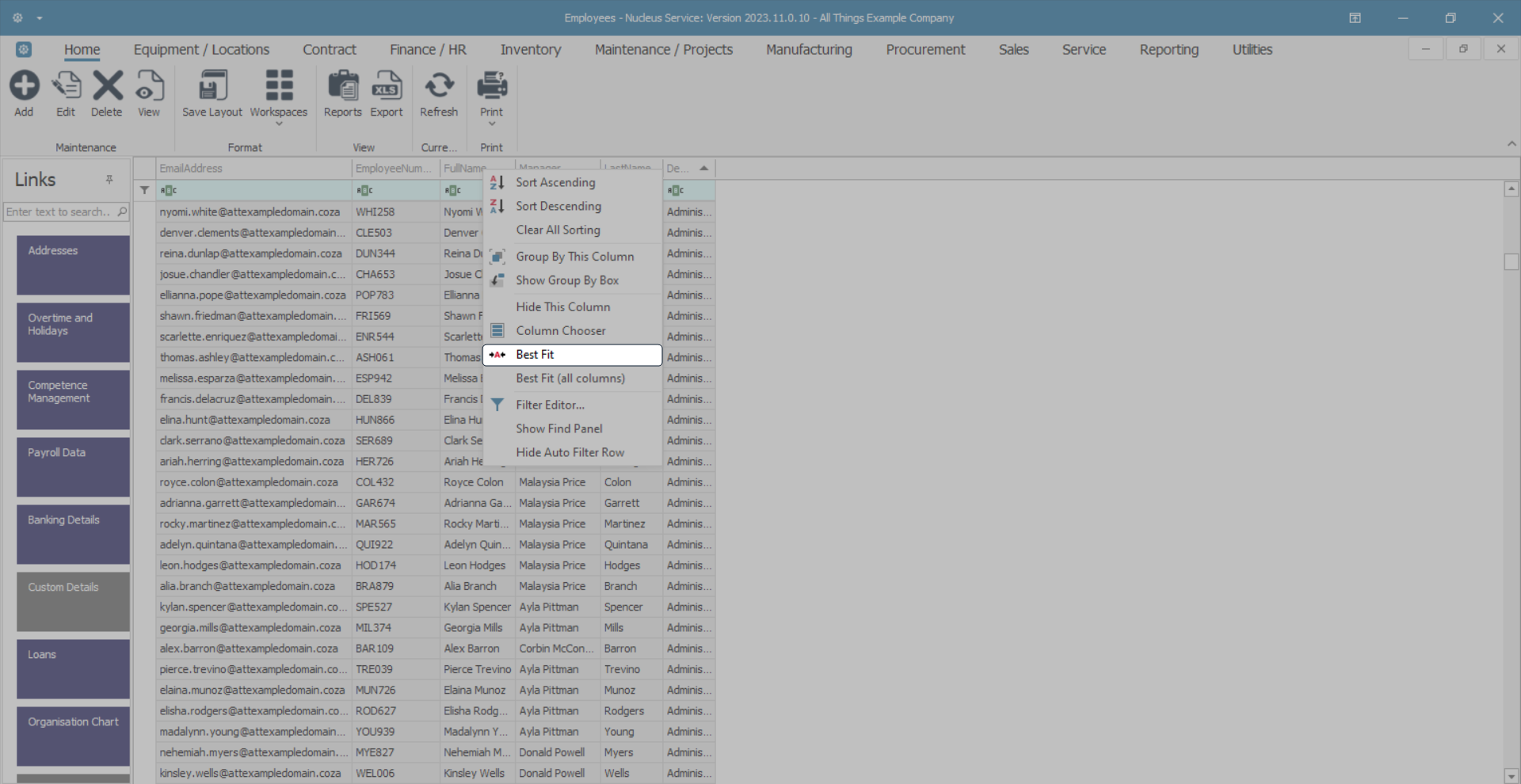
- The selected column will be resized width ways so that you can view the entire column contents.
Sizing Columns - Best Fit (All Columns)
- Right click in any column header cell to display the drop-down menu, then click on the Best Fit (all columns) option.
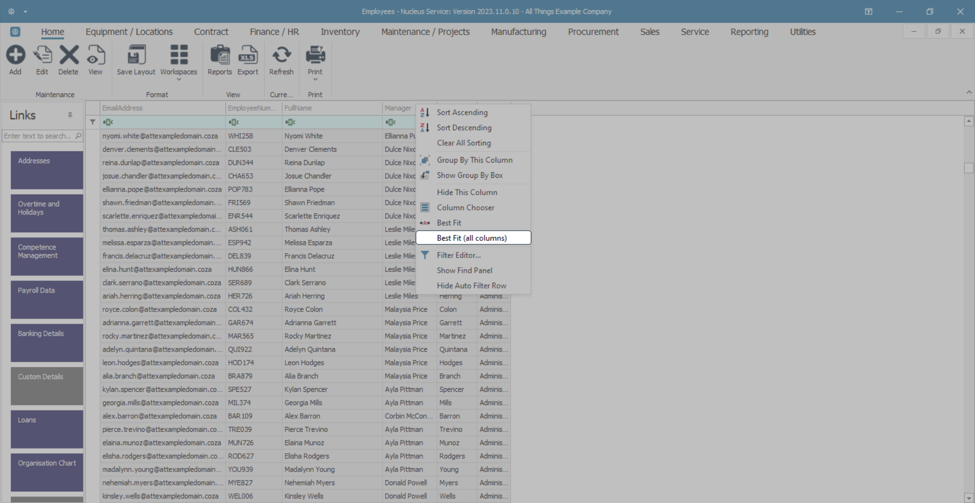
- This will resize width ways all the columns in your data grid so that you can view their entire contents.
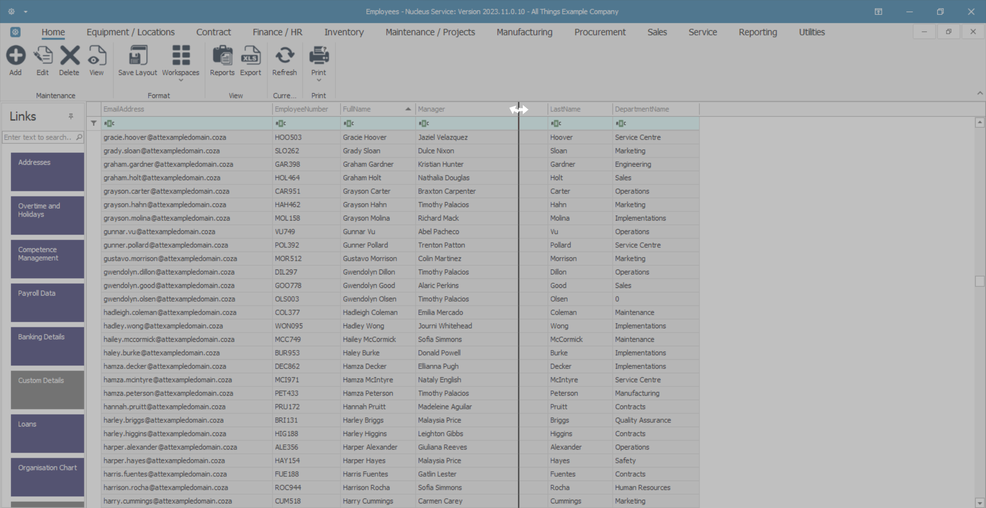
Sizing Columns - Moving the Dividing Line
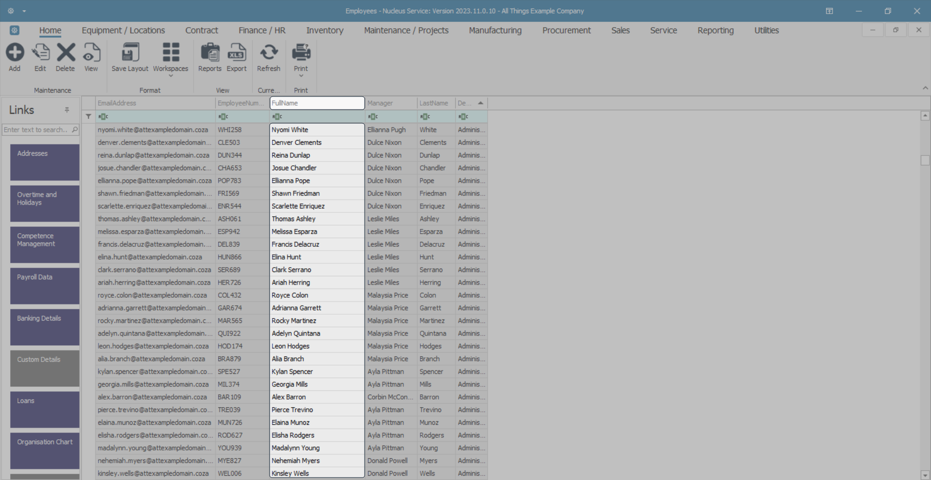
- You can also change the width of a column by clicking on the dividing line between two column header cells.
- The dividing line will highlight black.
- Two white directional arrows will appear.
- The column on the left of the dividing line will be sized.
- Move the mouse either left (to narrow) or right (to widen) the column.
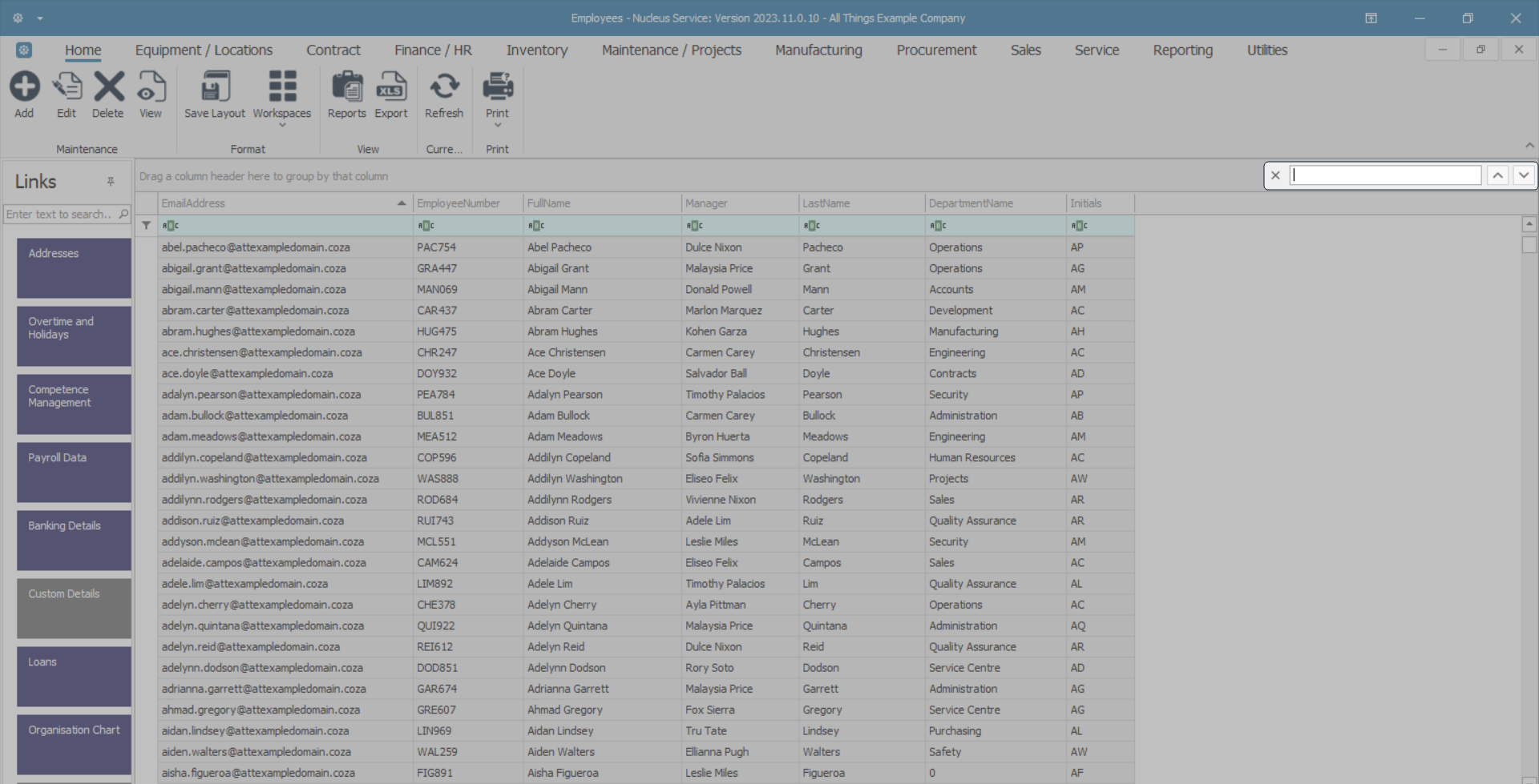
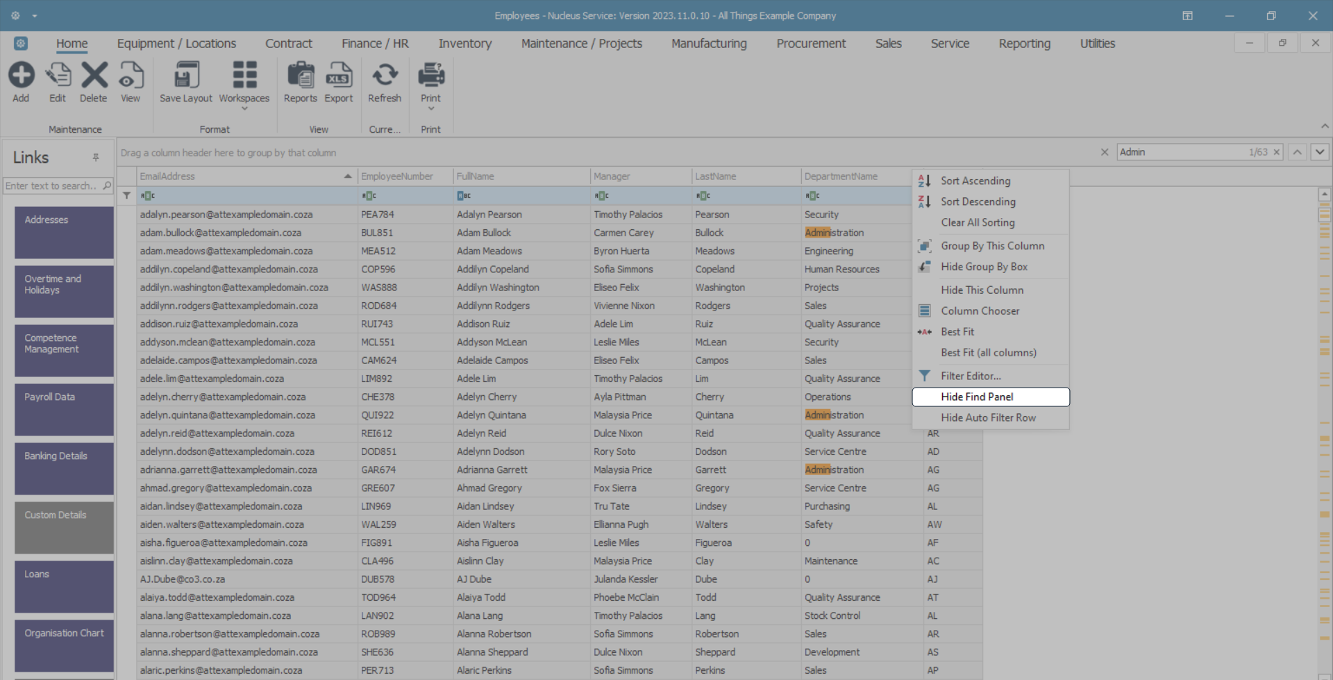
Show Find Panel
- Right click in any column header cell to display the drop-down menu, then click on the Show Find Panel option.
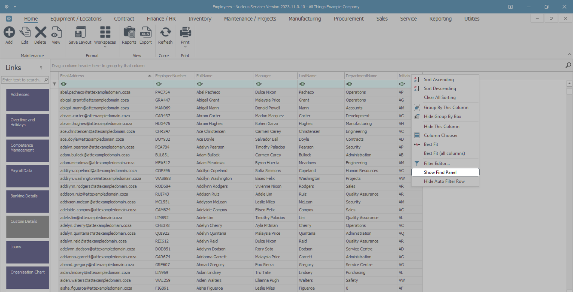
- The Find Panel will appear above the column header row.
- Type in any references you need to search for within the data grid.
- To hide the Find Panel, right click in any column header cell to display the drop-down menu, then click on the Hide Find Panel option.
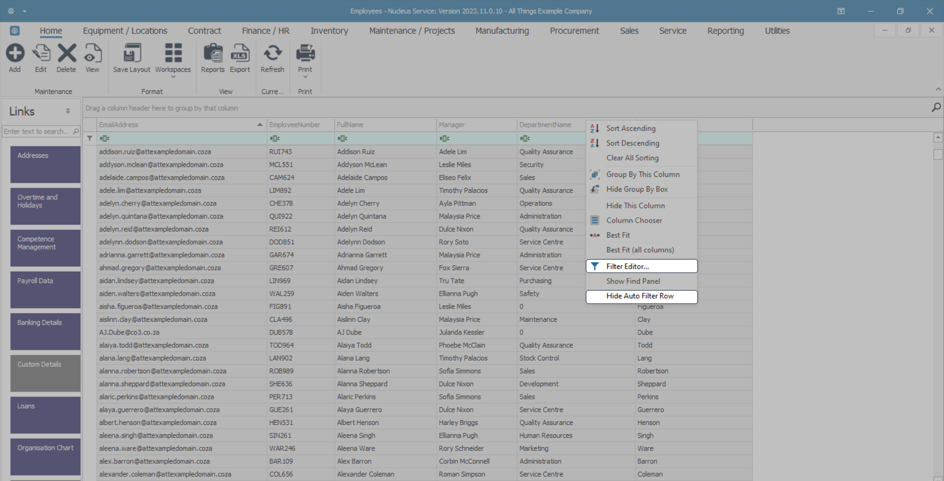
Filter Options
- The Filter Editor and Hide Auto Filter Row details can be found in the Data Grid Filtering manual.
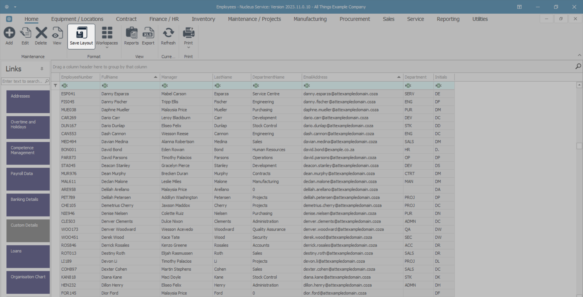
Save Layout
- When you have finished making changes to the data grid, click on the Save Layout action button before you close the screen.
- This ensures that your data grid set up changes will be saved and when you re-open this screen, instead of defaulting back to the original system setting, your data grid customisations will still be apparent.
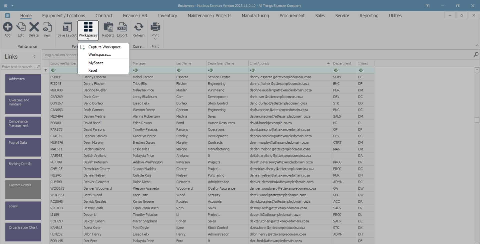
Workspaces and 'Reset' Screen
- You can use the Workspaces button to save any screen content and layout preferences.
- Workspaces refers to the grouping of windows on your desktop.
- The purpose is to reduce clutter and make the screen that you are working in easier to navigate.
- You can 'capture' multiple separate Workspaces for different groups of related tasks. For example, a Workspace you've named 'Reports', could contain certain selected frames, panels and columns displaying the data that you use to prepare reports.
- You might set up other Workspaces according to windows that you need to manage your projects.
- All of your captured Workspaces can be saved and named and will be listed in the drop-down list under Workspaces.
- You can also 'Reset' the screen to its original configuration before any adjustments were made.
- Click on the Workspaces icon to reveal the selections in the drop-down menu.
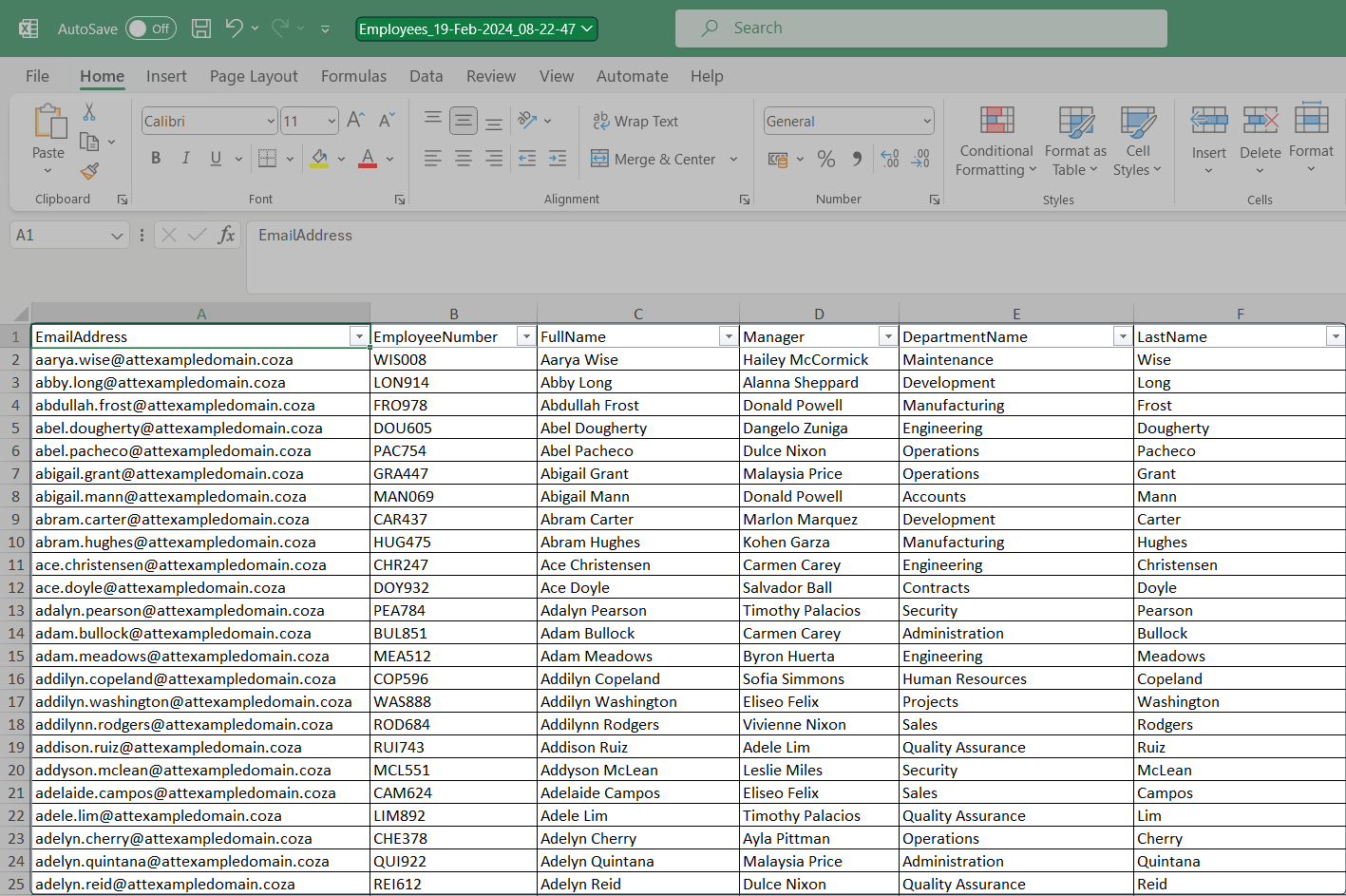
Exporting Data
You can use the Export button to export the data grid information to Excel.
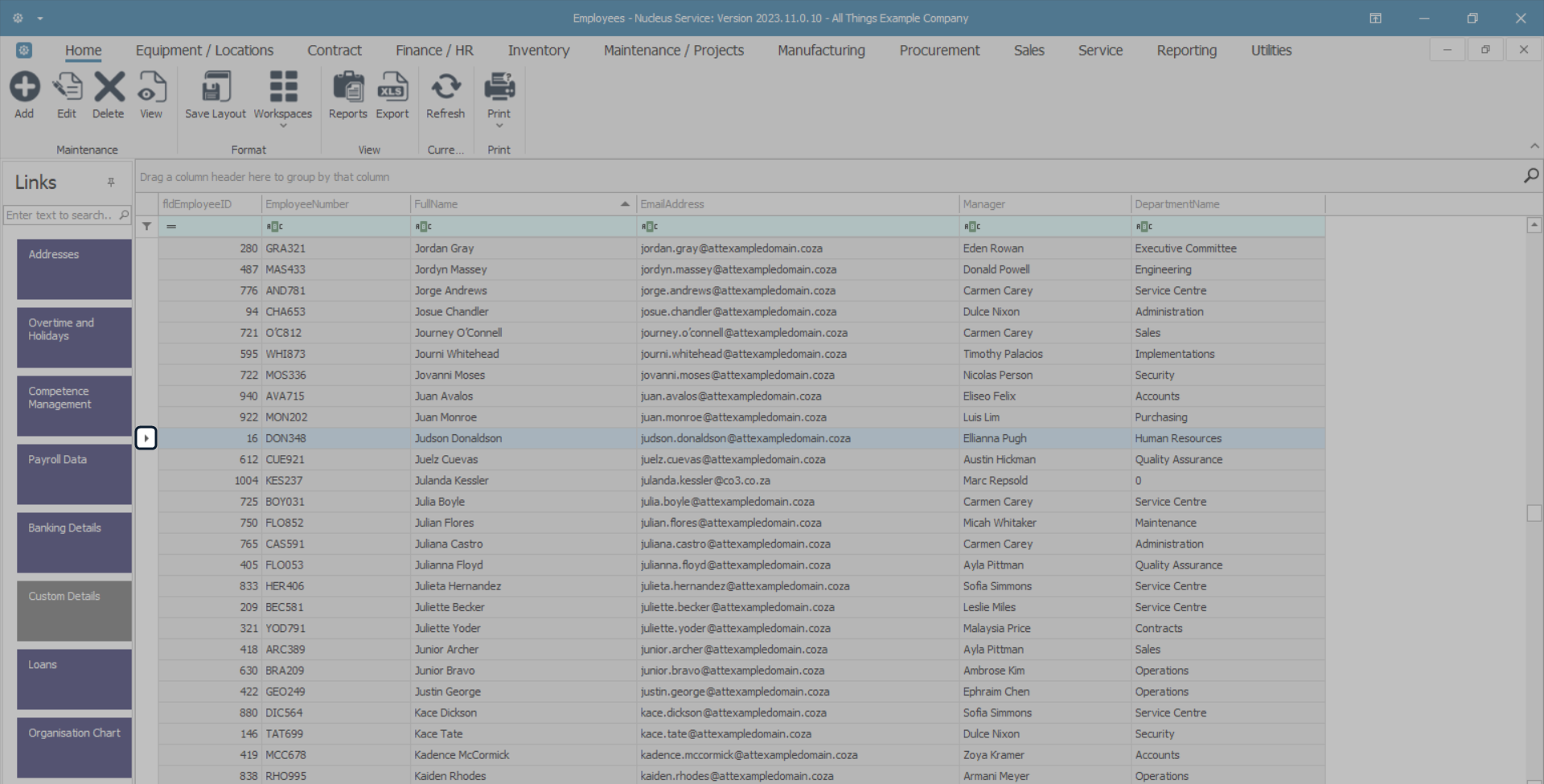
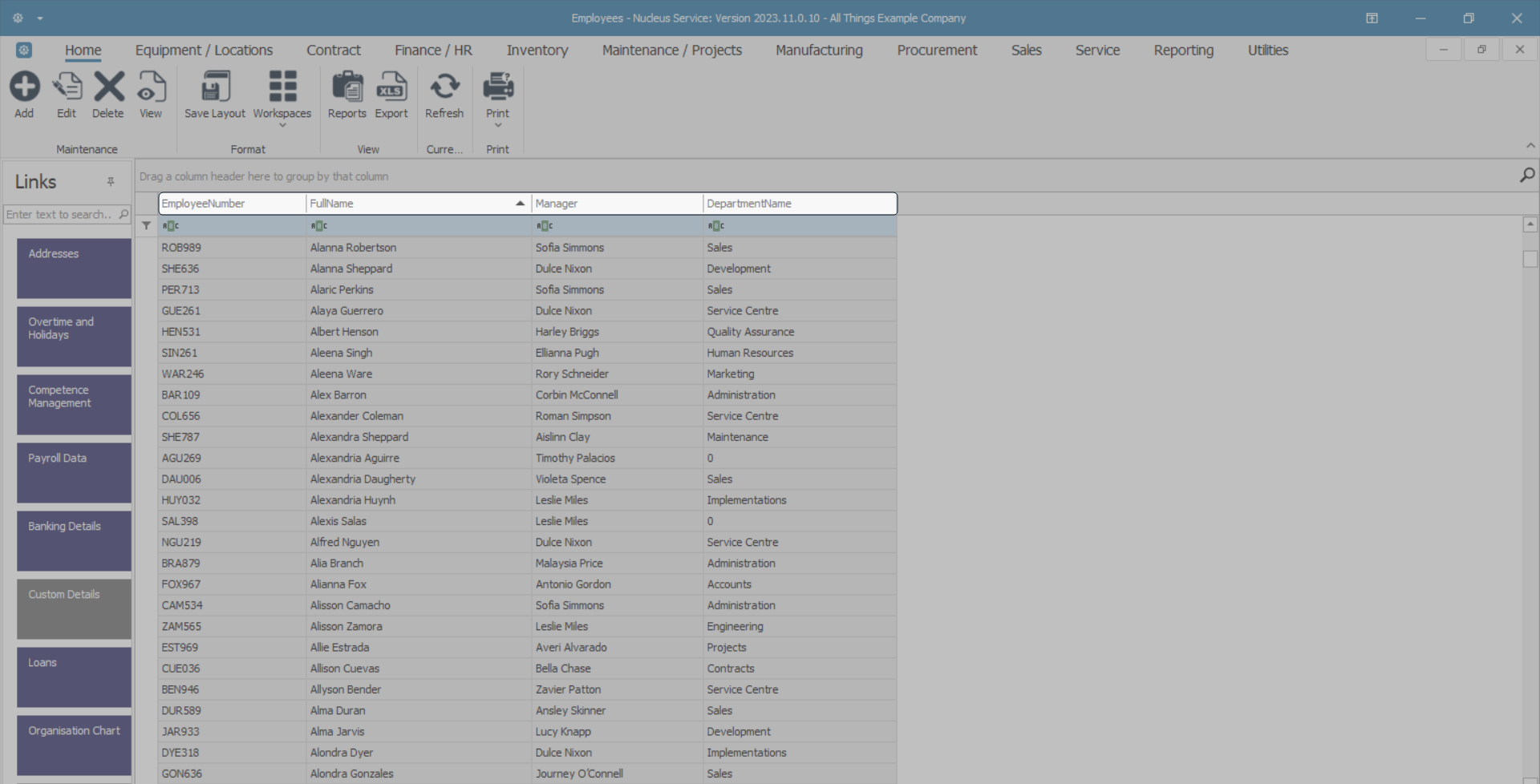
- Click on a Column Header to quickly sort the data in Ascending or Descending order.
- In this image, the data grid has been sorted by Full Name in Ascending order.
- Click on the Export action button.
- This will open Excel with a new spreadsheet and load all the data from the data grid into that spreadsheet.
- You can then view the data, search for data, prepare the spreadsheet for printing, etc.
MNU.003.001